The only media that can’t be skipped.
Why the most ambitious spirits brands treat the bottle as their primary marketing instrument — and how decoration makes the strategy real.
Every other channel has a skip button. The object doesn’t.
A bottle behind a bar is seen by everyone in that room. All evening. It travels on Instagram without a media budget — someone photographs their negroni, the bottle is in frame. It sits on a back bar for months, still communicating the brand long after the campaign that launched it has been forgotten.
The spirits brands holding premium price in a saturated market have understood something the industry is still catching up to: the bottle is not packaging. It is the most durable media placement in the plan — and unlike everything else, it compounds.
The object that earns its price
Premium in spirits has never been purely about the liquid. It has always been about the total object — what the bottle communicates before it is opened, how it reads in a room, what it says about the person holding it. The shift in recent years is not in the logic. It is in the precision with which the best brands are executing it.
In a category where the distance between a premium and a super-premium position is measured in perception rather than production cost, the visual language of the bottle carries disproportionate weight. Shape. Colour. Surface quality. The way decoration meets the curve of the glass without breaking. These are not finishing details. They are the argument.
Brands that have internalised this stop treating packaging as the last decision in a product launch. They treat it as the first — the frame inside which everything else, the liquid, the story, the price, becomes legible.
Two instruments. One intention.
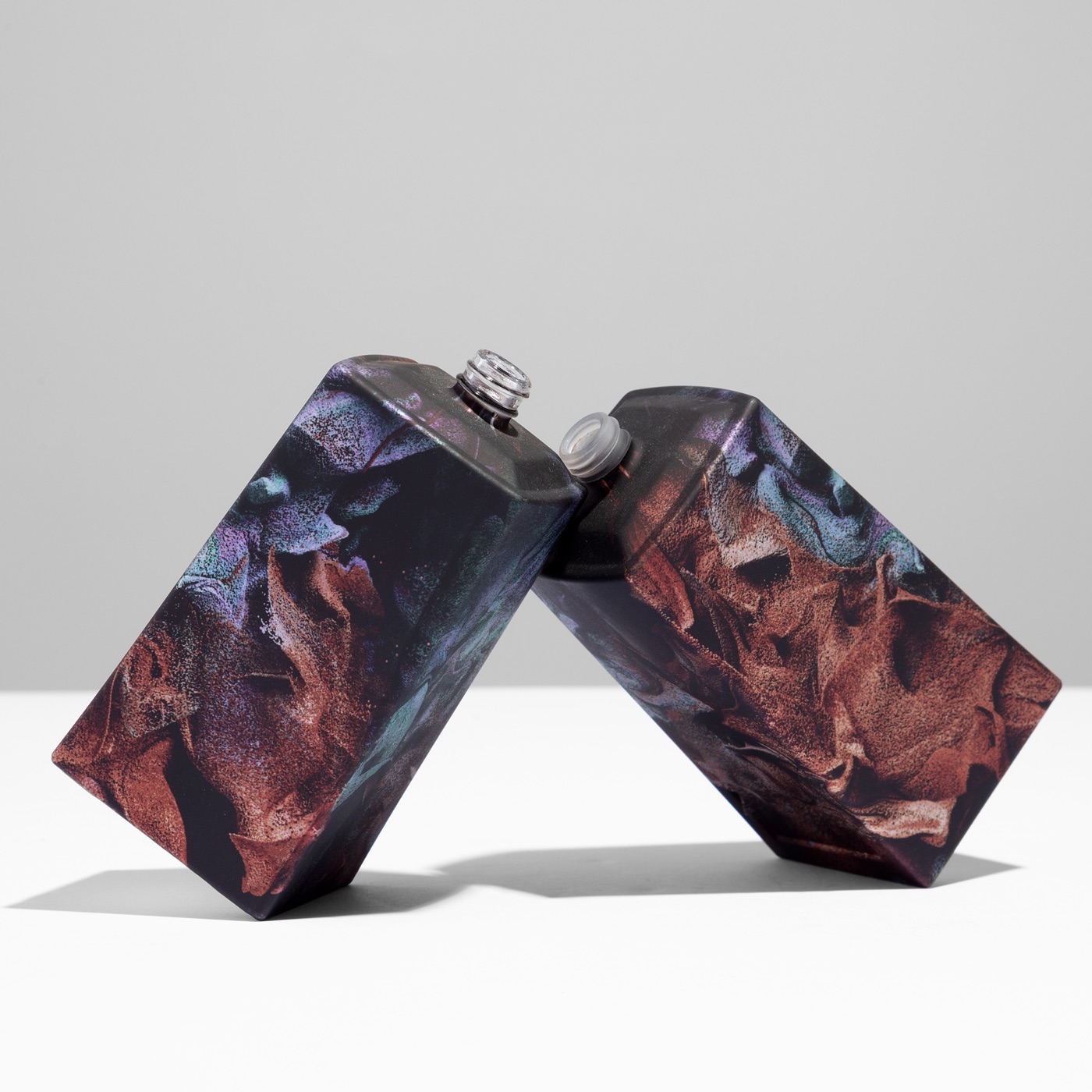
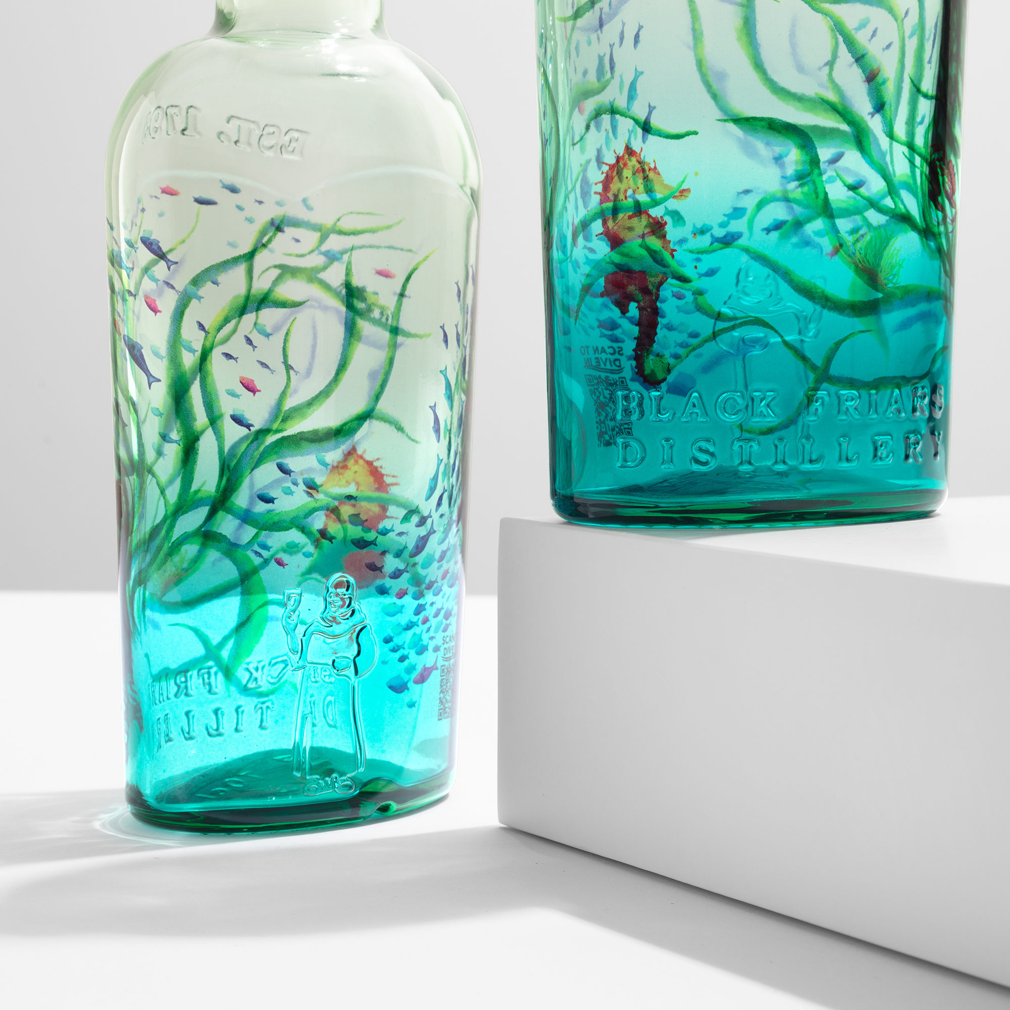
The iconic bottle.
An icon does not need a label to be recognised. The silhouette carries the brand. The geometry communicates category and price tier before a word is read. Building that kind of visual authority requires a decoration system that holds — the same colour language, the same precision, across every surface, every unit, every production run.
Sublimation on glass answers this demand structurally. The decoration bonds directly into the glass at HD 1200 dpi across the full 360° of the bottle. What the creative director approved becomes what lands on the back bar. Precisely. Every time.
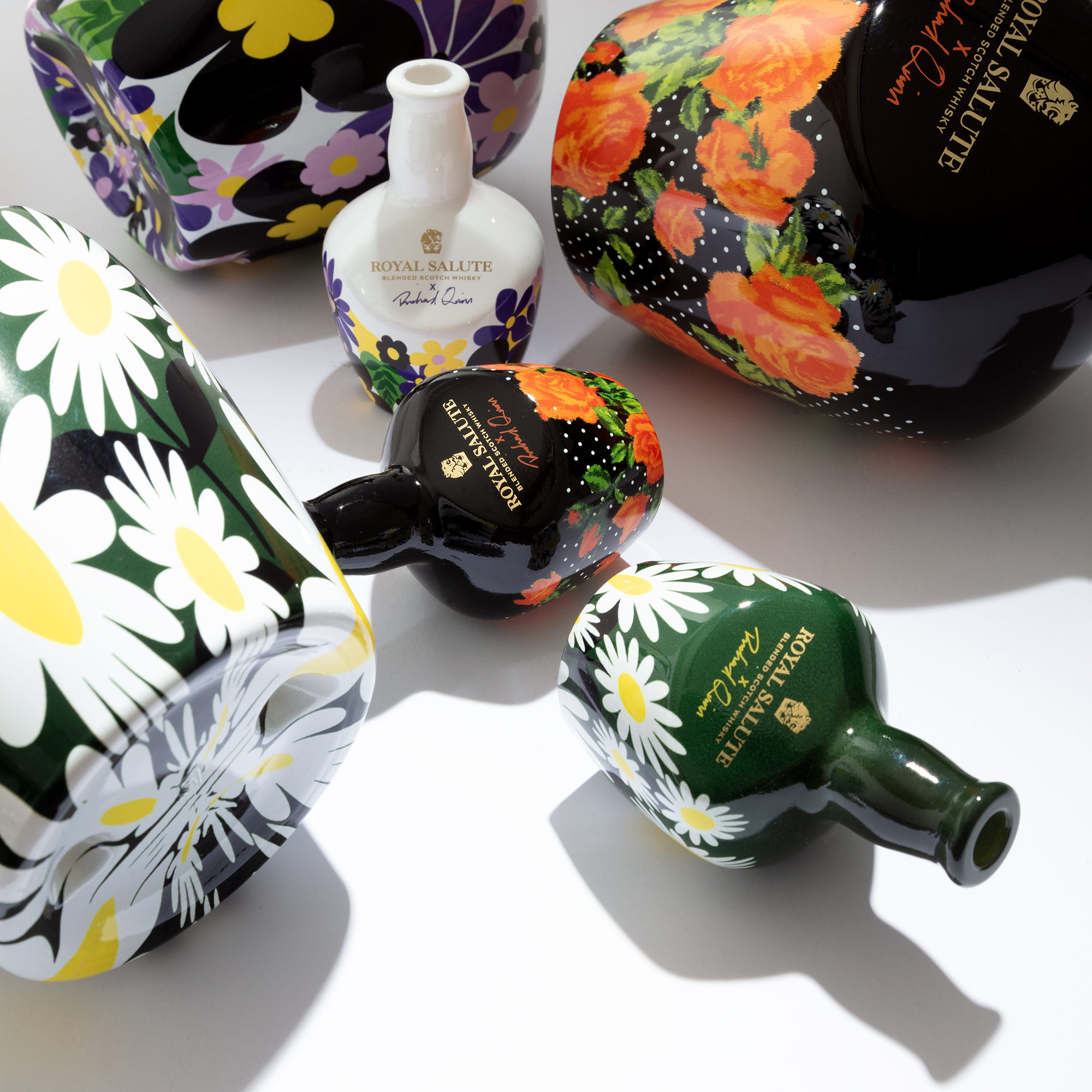
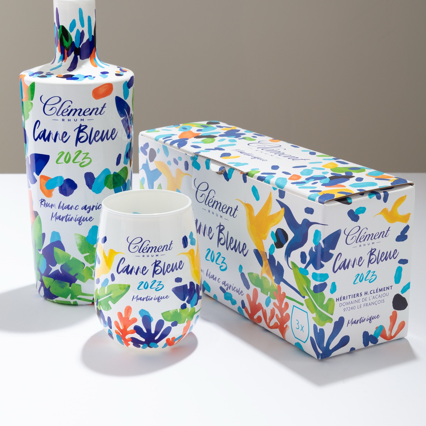
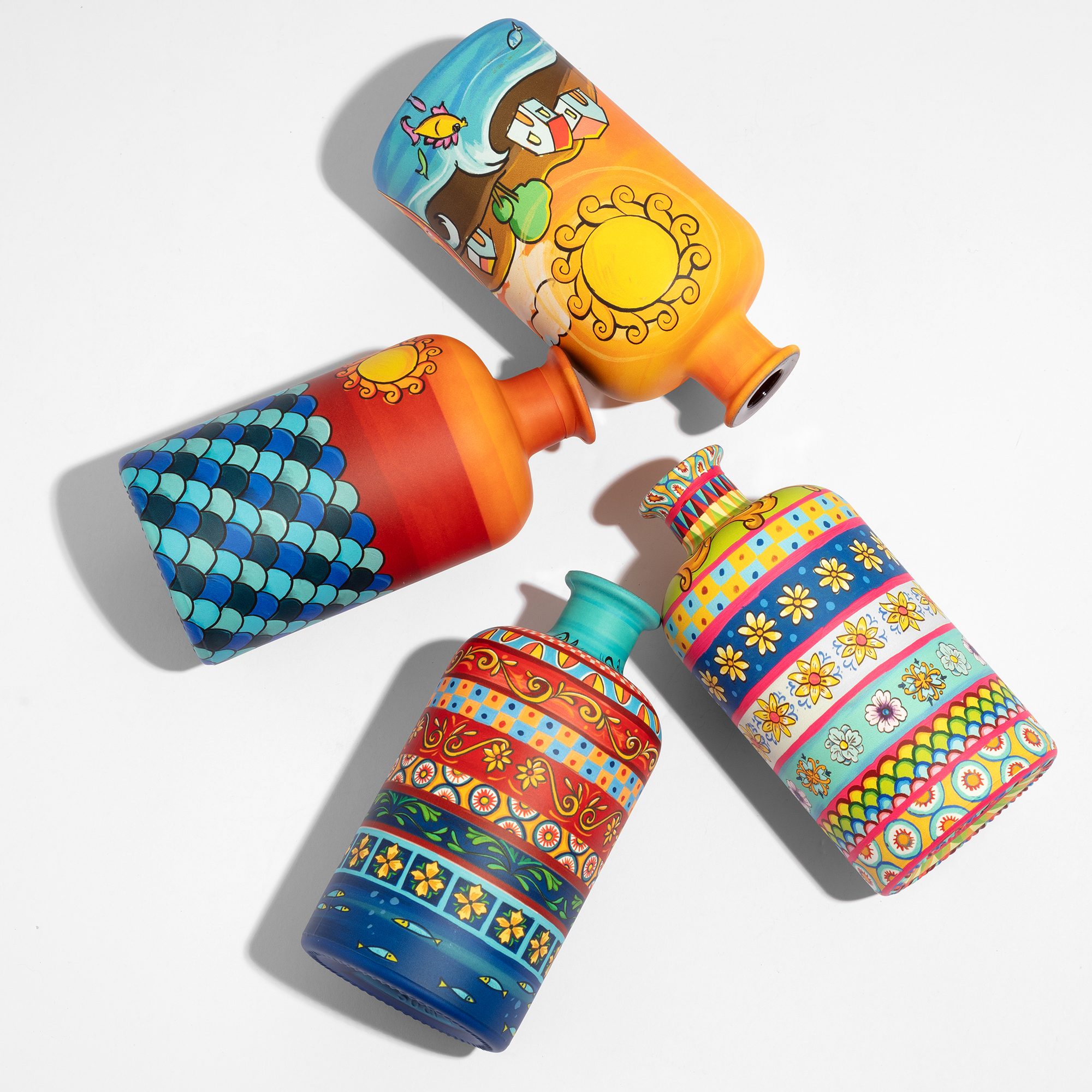
The limited edition.
A limited edition with real intention does three things simultaneously. It creates a desirability peak that reinforces the core range rather than diluting it. It earns attention in the trade and among collectors without relying on paid media. And it gives the brand a reason to return to the conversation with something genuinely worth looking at.
The Royal Salute Fashion Collection remains the clearest illustration. A collaboration where the bottle had to hold the visual logic of a fashion house — exact colour, complex surface, collector coherence across a series. The liquid was already trusted. The object had to earn its moment entirely on its own terms. It did.
The execution gap
The strategy is not complicated. The execution is where most brands leave value on the table.
A limited edition that takes eighteen months to produce arrives after the moment has passed. A collector series that drifts in colour between batches loses the coherence that made it a series. A bottle designed for full surface coverage, produced with a technique that cannot handle the geometry, becomes a compromise nobody briefed.
Speed and precision are not production virtues. They are strategic ones. A 50,000-unit limited edition, sample in 10 days, produced in a single shift, from brief to shelf in a timeline that matches the campaign calendar — that is the infrastructure that makes the strategy executable rather than aspirational. The brands that have found it are running campaigns the others are still planning.
Built for this brief
The strategic packaging brief for a premium spirits brand arrives at decoration with specific demands. Colour precision that holds across a collector series. Agility that matches a campaign window. Scale that makes short runs economically coherent without compromising the finish.
Agility. Sample in 10 days. Production in a single shift. When the activation is tied to a collaboration launch or a seasonal moment, the decoration timeline holds the schedule — not the other way around.
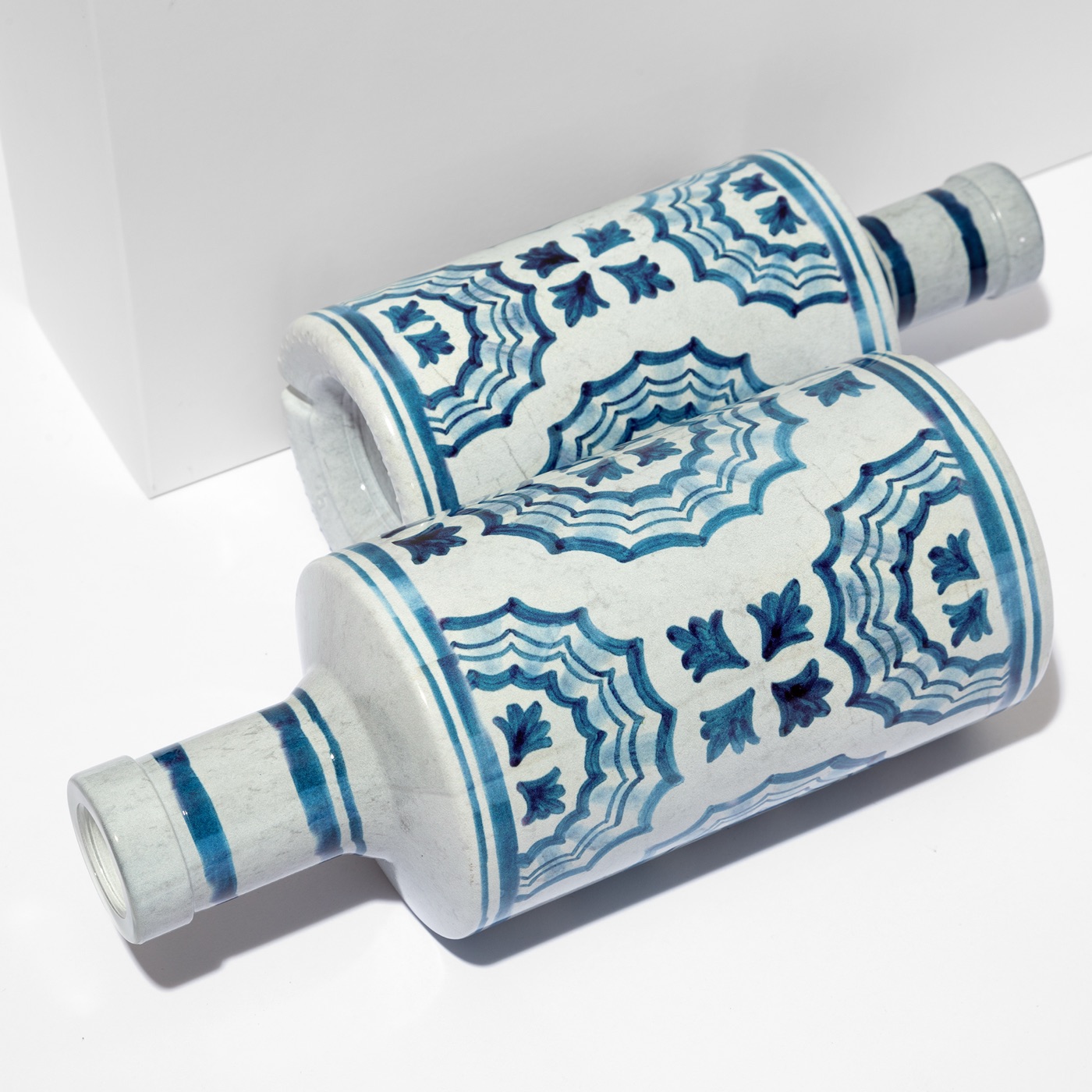
Canvas. The entire bottle as a single, uninterrupted communication surface. For brands building recognisable silhouettes, full 360° coverage is the foundation, not the ambition.
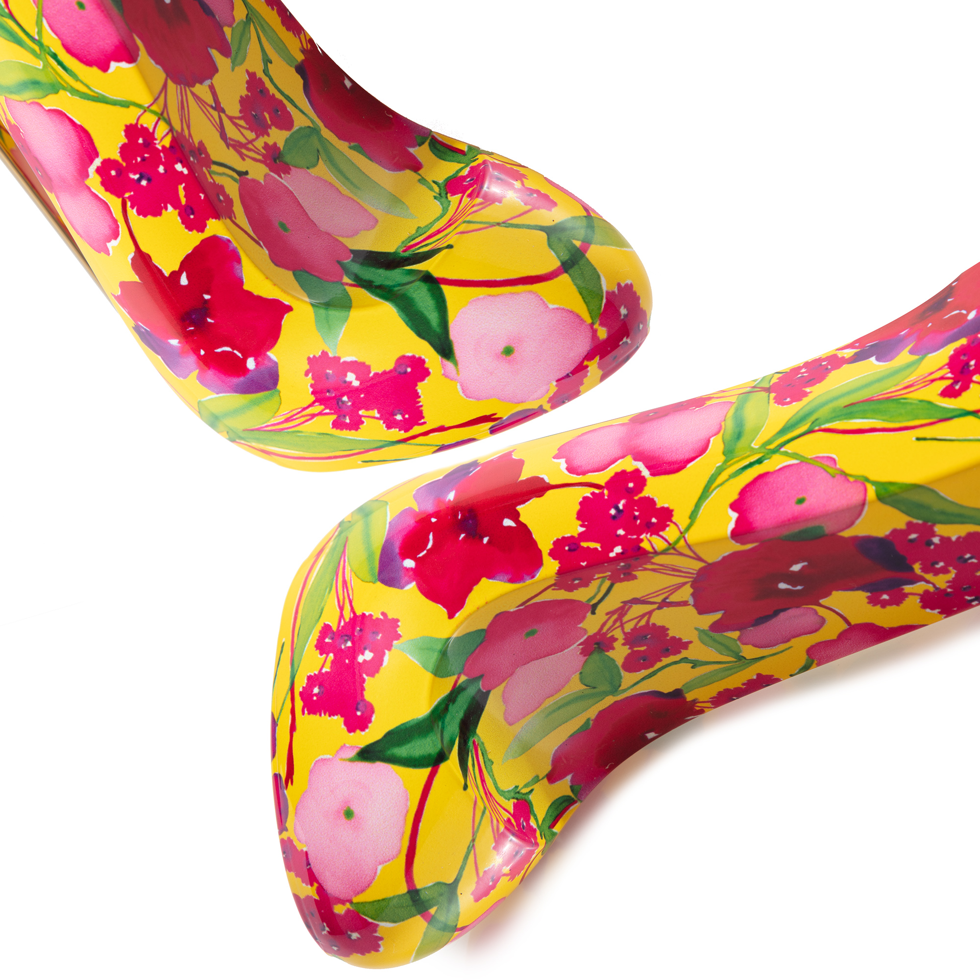
Precision. HD at 1200 dpi, water-based inks bonded directly to glass. The colour becomes part of the object. That is the distinction that reads across a room, holds in a photograph, and compounds across every back bar the bottle lands on.
Freedom. Square decanters. Tall profiles. Custom geometries that define a silhouette rather than follow a convention. The brands that own a shape own a position. ATIU is built for the briefs that require both.
The campaign that doesn’t end
A bottle behind a bar is still working six months after the campaign ended. Still earning attention, still communicating the price point, still making the argument. The brands that understand this are not spending more on packaging. They are spending it with more intention — on objects that do the work long after the media plan has gone dark.
Start with the object. Talk to us →