After the beige decade.
Dopamine design is back on the shelf — and 2026 is the year glass joins the conversation.
For ten years the shelf went quiet. Sand, off-white, oat. Typography in lowercase, the same neutral on every facing. Minimalism became the global accent. By 2024 it had become a uniform.
Then the colour came back.
Not gradually. Not as a niche. The shift had a name before it had a category — dopamine design — and it crossed every adjacent surface before it reached glass. TikTok feeds first. Then candy aisles, soft drinks, beauty. Fast Company tracked the migration from feeds to shelves. Plastics Engineering explained the mechanism: bright colour and unexpected pattern light up the visual cortex, dopamine is released, the object stops being an object. It becomes the lift.
In 2026 the trend has reached premium. Quietly, but unmistakably.
A new chromatic vocabulary
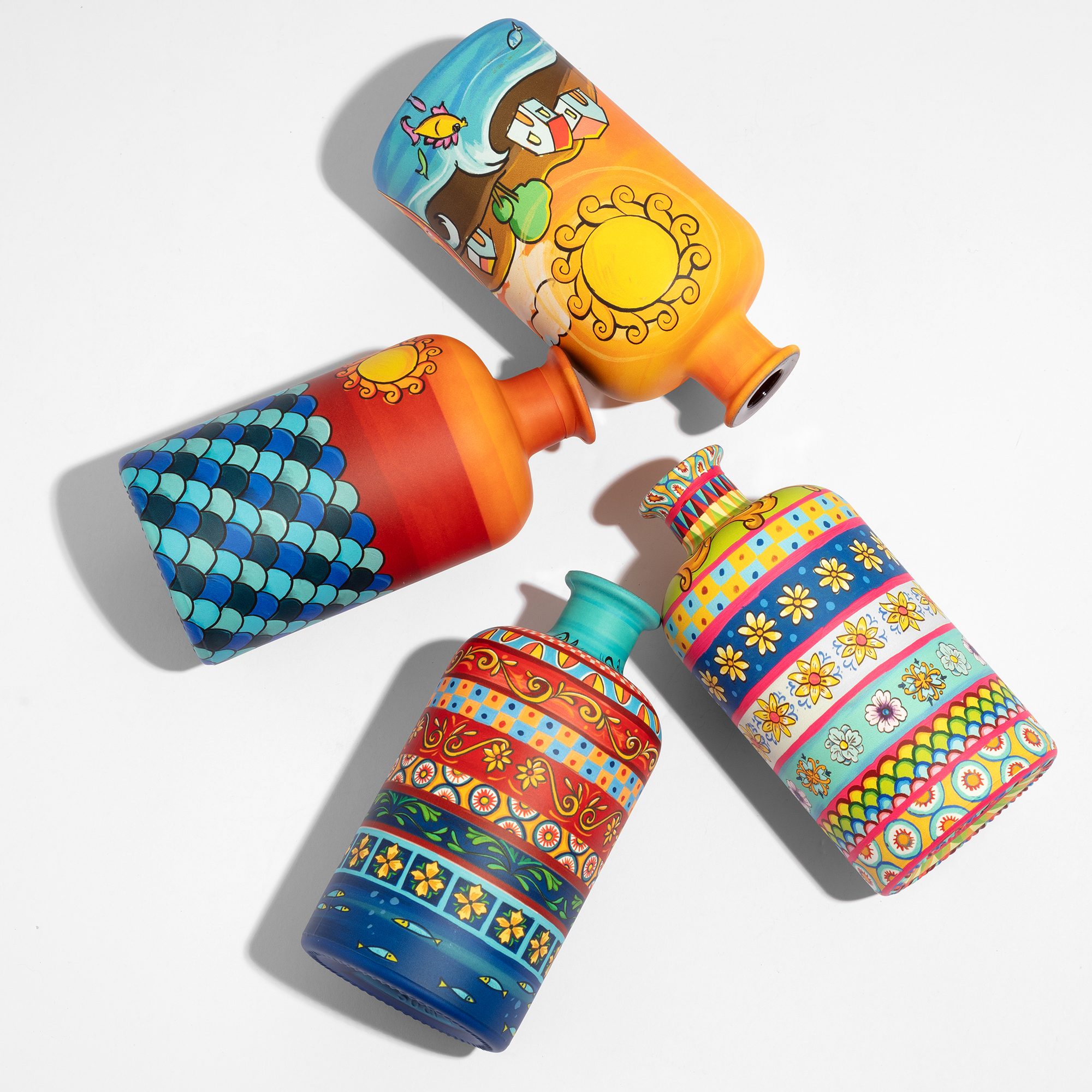
What is on the shelf this year is not the colour of the early 2000s. It is sharper, more engineered, more aware of itself.
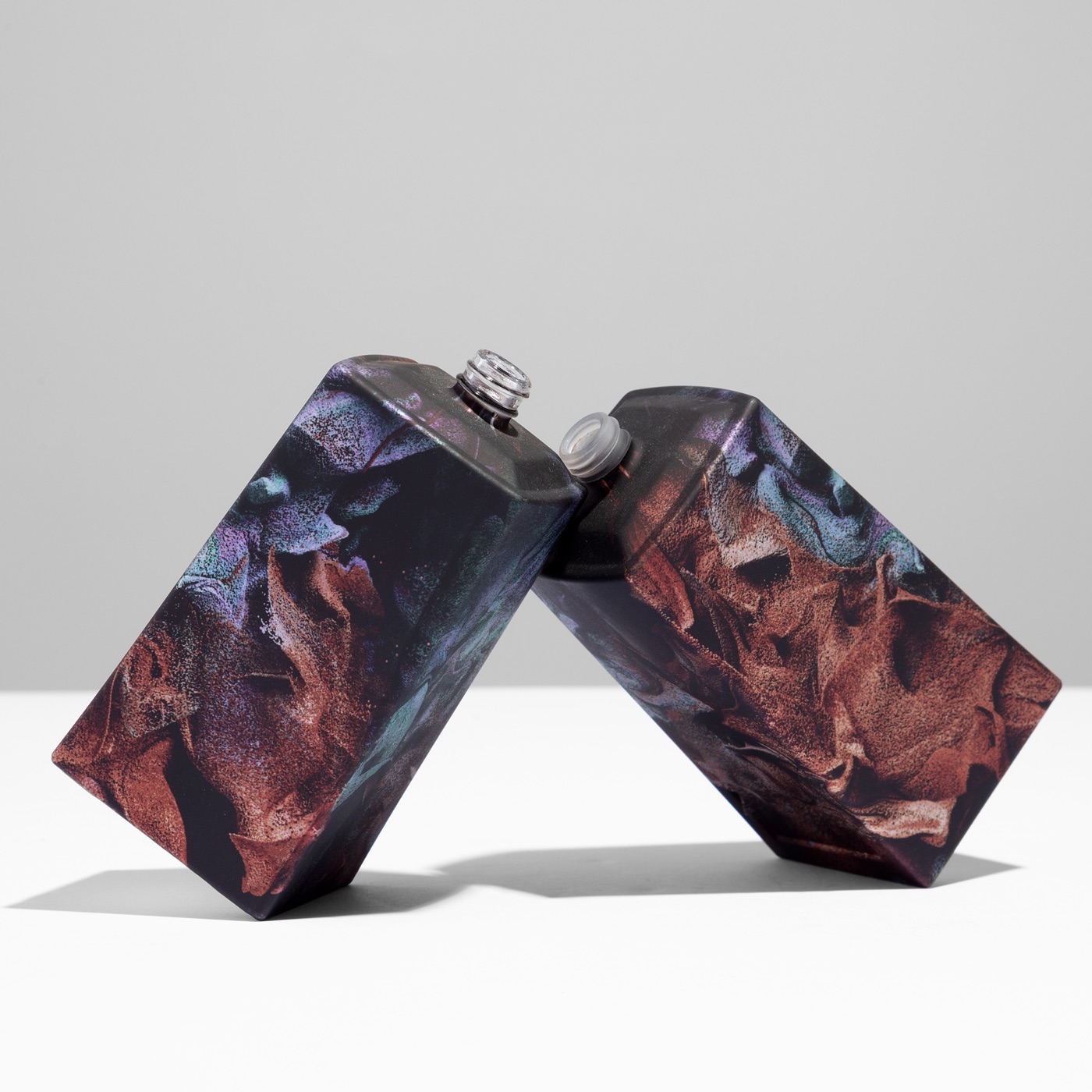
Thermal Glow stacks neons — magenta into cyan into electric blue — and lets them bleed into one another like a heat map. The edges feel cinematic, almost lit from inside.
Neon Shock keeps the base grounded — silver, graphite, charcoal — and lifts it with a single fluorescent accent. Restrained. Surgical. The premium-side reading.
Cosmic gradients layer iridescent pastels into pearlescent shifts. Y3K typography. Holographic finishes that catch the light differently from every angle.
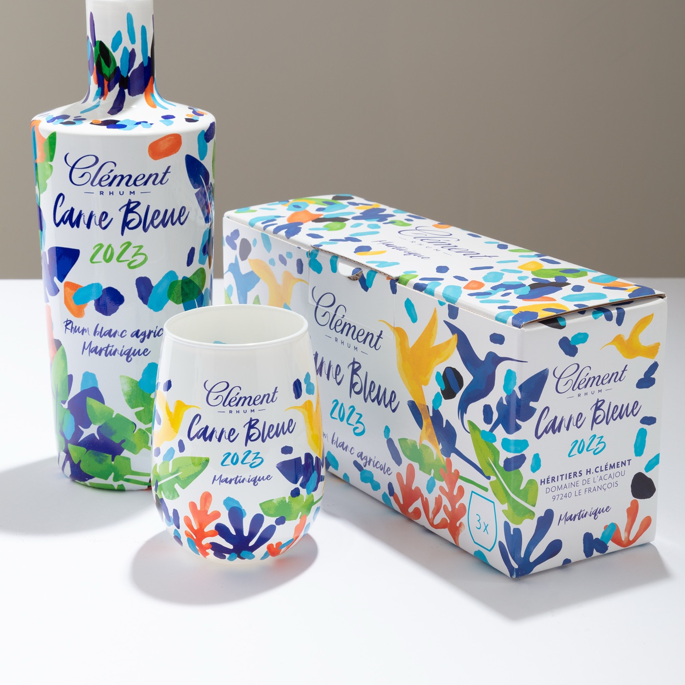
Dopamine maximalism, the loudest dialect, runs underneath all of it. Saturated reds, greens, yellows. Y2K nostalgia metabolised by a generation that never lived it.
Four registers. One shared demand: continuous colour, held precisely, across a full surface.
Why now
The cultural reading is well-rehearsed. A post-pandemic appetite for sensory uplift. A Gen Z buyer who treats unboxing as the product itself. A reaction — overdue, maybe inevitable — to a decade of visual restraint that started as discipline and ended as silence.
There is a category-specific reading too. After ten years of beige convergence, premium spirits and luxury fragrance look almost identical on shelf. The category cue — restraint — has become a problem. Restraint at scale stops signalling luxury. It signals sameness.
Colour is how the prestige categories climb back out.
The glass question
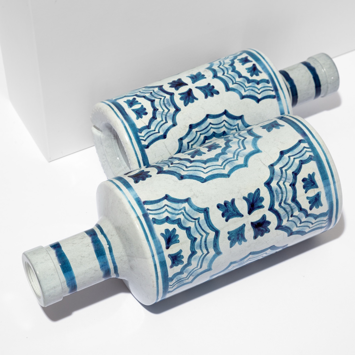
For most of decoration history, bold colour on glass meant compromise. Solid blocks, line work, a limited number of separations. Gradients had to be approximated. Saturation drifted across the curve.
The dopamine vocabulary is intolerant of all of that. Thermal Glow is a gradient or it is nothing. Neon Shock collapses if the base wavers. Cosmic gradients live or die on continuous tone.
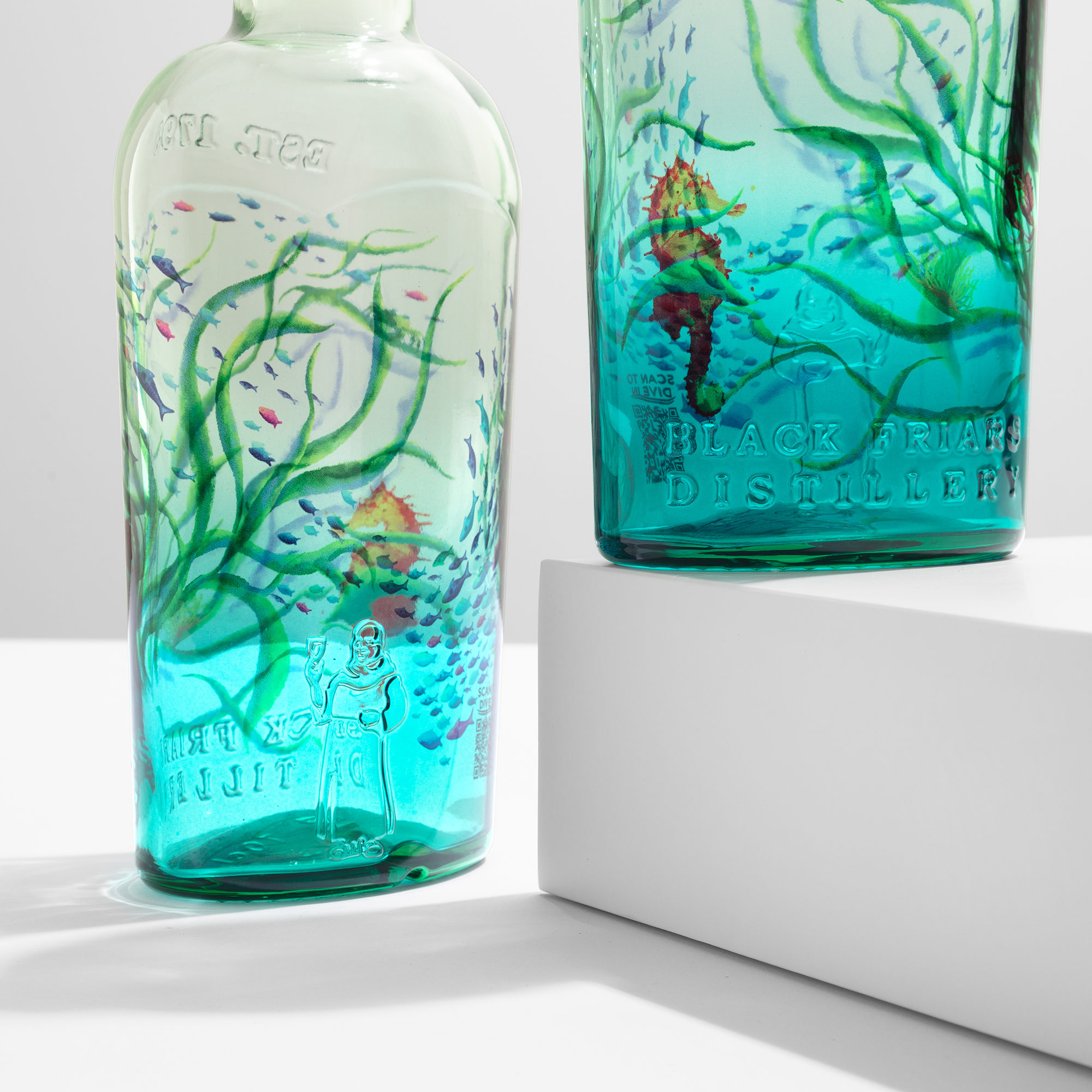
Sublimation prints in CMYK. Four-channel digital colour, resolved at 1200 dpi, bonded directly into the glass surface across the full 360° of the bottle. The gradient is rendered the way it was rendered on screen, and it lands on the bottle the same way. No banding. No separations to register. No flat patches where the gradient should breathe.
Iridescent and metallic effects come from the primer — they can sit as the base or layer on top, depending on how the colour is meant to read.
It is the most direct translation of the dopamine vocabulary onto curved glass available right now. The bottle becomes the screen.
How premium is reading it
The first dopamine bottles on premium shelves are not loud. They are precise.
A ribbon of magenta across a smoked spirit. A holographic icon, isolated, on an otherwise editorial fragrance label. A gradient from cobalt into ultraviolet on a bottle whose silhouette is otherwise austere. Bvlgari with Refik Anadol anticipated this register before the trend had a name.
The discipline at work is controlled contrast. One charged element. One quiet base. The dopamine reading is instant — legible in the four seconds a buyer spends in front of the shelf — and the category cue stays intact.
Restraint hasn’t disappeared. It has changed register. From quiet typography to quiet base, from neutral palette to neutral architecture with one charged note. The premium dialect of dopamine is not maximalist. It is selectively electric.
A short window
Trends like this have a shape. They start in beverages and candy. They cross to beauty. They reach prestige spirits and luxury fragrance last — and by the time they arrive in volume, the early movers have already shaped the visual category.
The window for premium glass to engage with dopamine design before it reads derivative is the next two to three quarters. After that the look becomes shorthand. The brands that translate it carefully now — from concept to shelf, one accent, one gradient, one bottle that pulses against quiet neighbours — will own the reading.
Walk a duty-free rotunda at the end of 2026. The bottles that pull you in will share one quality. The colour was held, not just printed.
Translate the trend on glass. Start with a sample →