Four seconds on the duty-free shelf.
How travel retail changed what a premium bottle has to do — and how to brief for it.
A passenger walks into the spirits hall at Heathrow Terminal 5. Forty minutes until the gate call. Their eyes sweep the shelf.
They give each bottle about four seconds.
In those four seconds, the bottle has to do three things. Stop them. Invite them closer. Promise something different from everything around it. If it fails at any of those, the passenger keeps walking.
Travel retail is a different world. The rules that work in a supermarket, in a specialist shop, on a brand’s own e-commerce, don’t apply here. A duty-free shelf is maybe the only place left in premium spirits where packaging has to do more of the work than the brand itself.
This is a working guide to designing for that.
The buyer isn’t the buyer
Traditional retail is about a repeat customer. Someone who already knows the liquid, already trusts the brand, already has context. Airport retail is a one-shot environment.
The passenger in a duty-free store is often a lighter buyer. Buying a gift, or a self-treat. They may never have heard of the producer. They don’t have time to read a label. They can’t compare reviews. They can’t ask a sommelier.
Every signal in the bottle is the entire pitch.
Which means the bottle can’t be a badge for something else. It has to be the thing. It has to look the way a premium product should look. Feel the way a premium product should feel. Catch the light in a way that says this is not the standard. In four seconds.
For brands used to briefing packaging as one input among many, travel retail inverts the hierarchy. Here, the bottle is the campaign. This is the context where the right decoration partner makes the difference between a launch that sits and a launch that moves.
What the airport shelf rewards
Airport shelves have bright, hot, flat fluorescent light. Everything on them is shiny. Everything is gold or silver or white or black. Every bottle has been optimised for shelf impact over forty years of refinement. The standard techniques produce excellent work — but an airport shelf is a room full of excellent work. Stand-out has become the harder brief.
A bottle that stops a passenger in four seconds usually does one of two things that the shelf around it does not.
One: unexpected form. But new glass is expensive to mould. A new mould runs into six figures. Lead time is months. Risk is upfront.
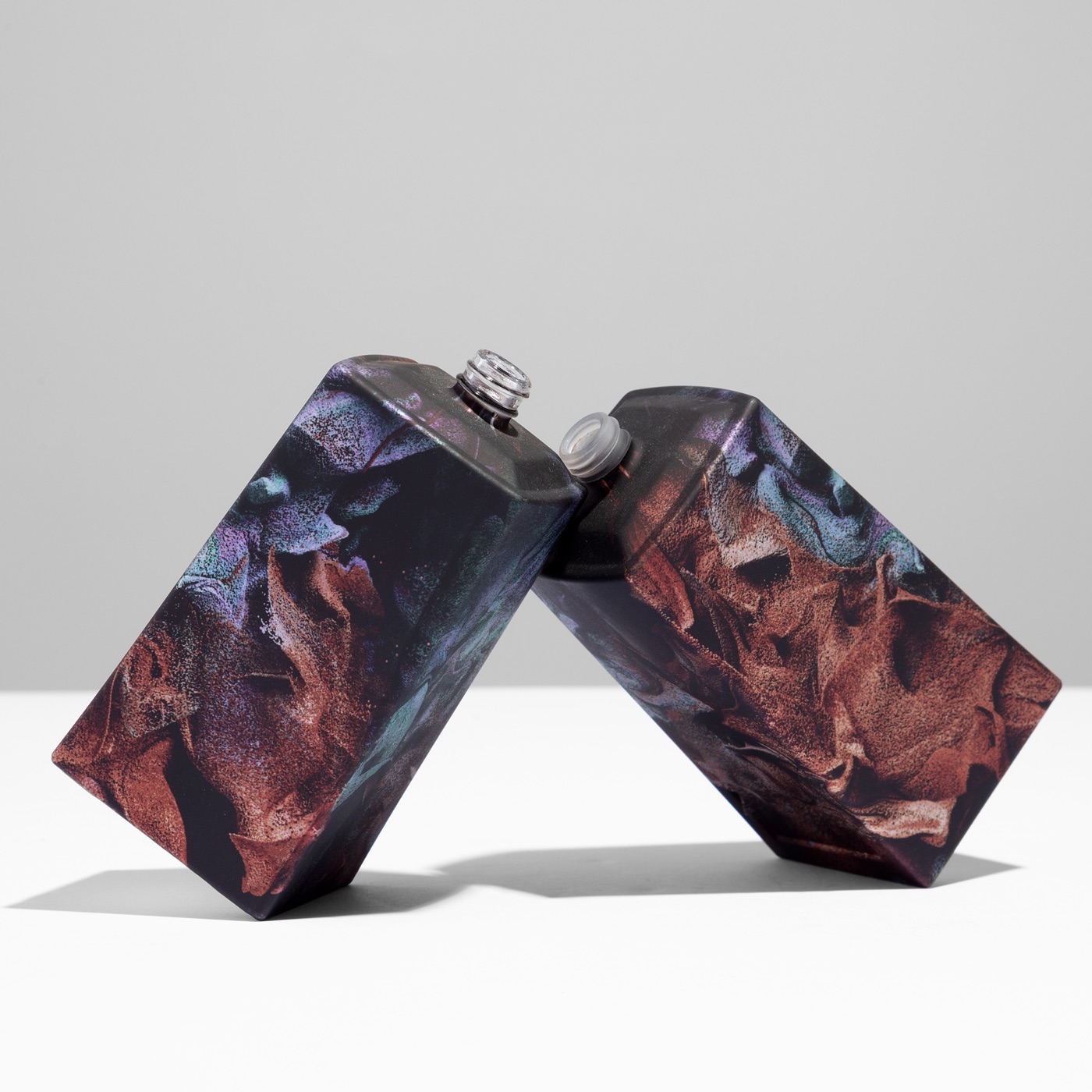
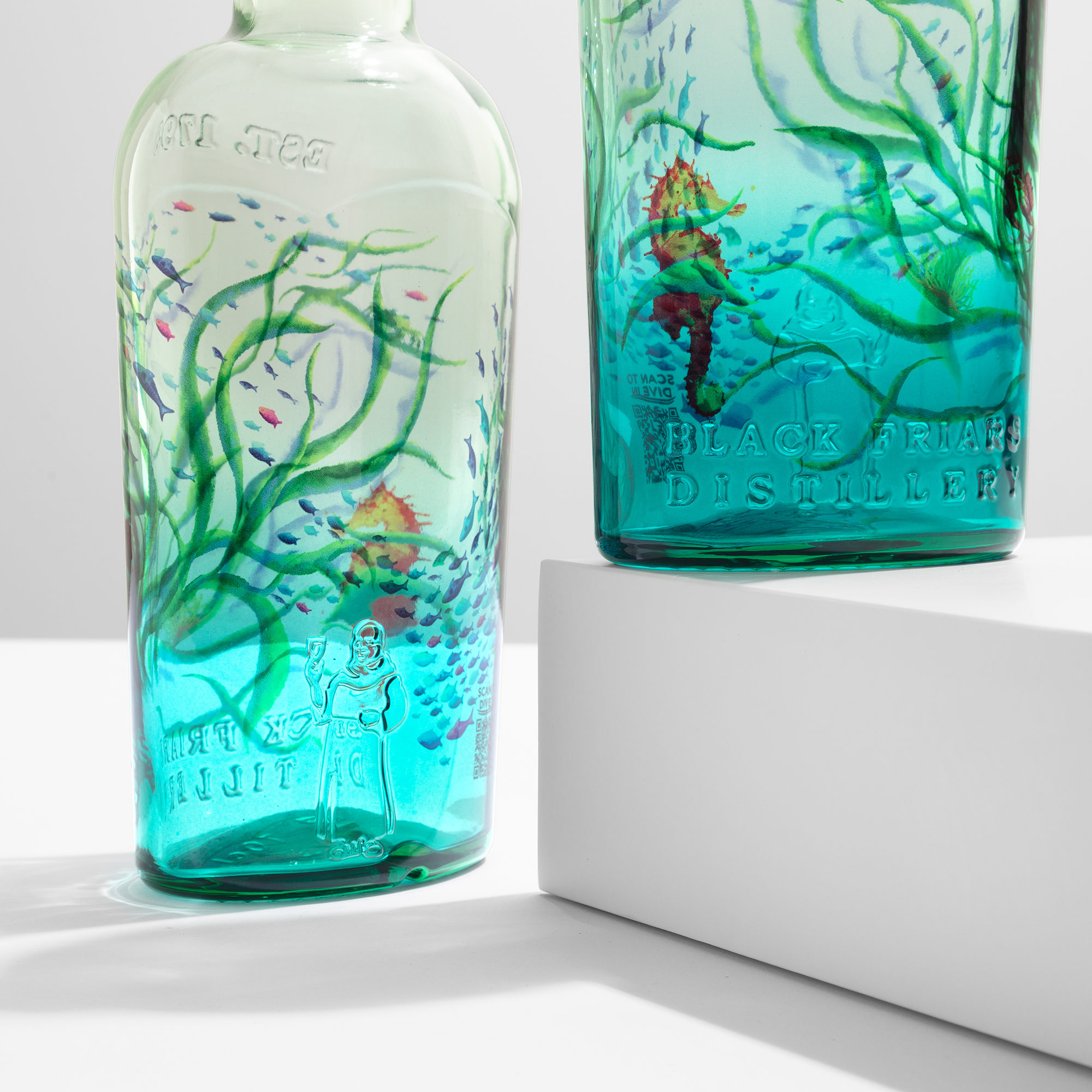
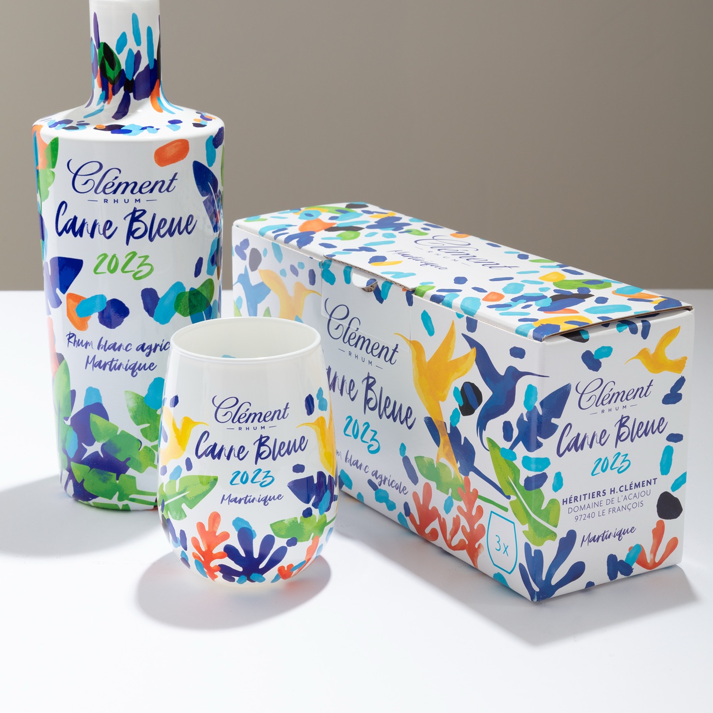
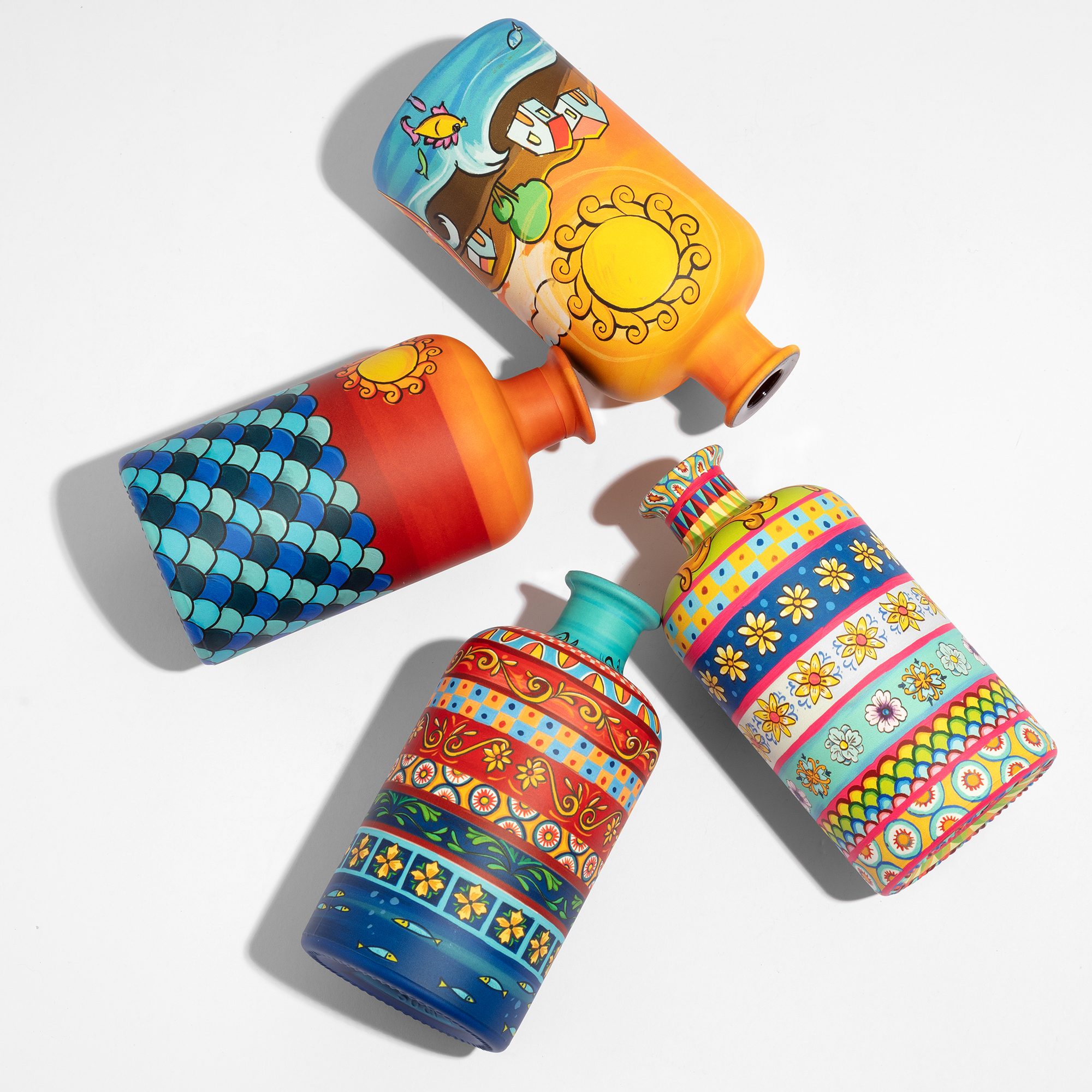
Two: decoration without compromise. A standard-mould bottle, decorated across its full surface with artwork that feels authored rather than applied, arrives quickly, in the right volumes, with no concession to geometry. This is the path that most new travel retail programmes are taking — and the path ATIU was built for.
Full-body digital sublimation does the work in a single pass. HD artwork at 1200 dpi on the entire curve, neck to base. No plates. No screens. No seams. What a creative director draws on Monday comes off the line on Friday.
The shelf rewards that conversation.
The touch test
After the eye, the hand. The passenger who stops, picks up. In airport retail, picking up is the single strongest predictor of purchase. The buyer is deciding if the bottle feels as good as it looks.
Layered decoration can read differently in the hand than it does on the shelf. Hot stamping is a surface addition — under a finger it reads as an addition. A non-integrated decoration around a premium bottle introduces a different texture layer: the weight is right, but the surface is not glass. The touch often tells the buyer what the eye couldn’t quite read.
Full-body sublimation is different because the artwork is not on the glass. The artwork is part of the surface. Nothing to lift, nothing to peel at, nothing that reads as separate. The bottle is decorated and still feels like one object.
A small detail. But the passenger is reading it. In those few seconds of hand, they are voting on whether the liquid inside deserves the price on the shelf. If the bottle wins the vote, the rest is easy.
How full-body finishes compare technically with traditional approaches →
Why ATIU’s sublimation is the right technique for travel retail
Travel retail is its own brief. Short window. Tough buyer. Single-SKU launch. The technique has to work for all three — from the first sample to the last case on the line.
Four reasons full-body digital sublimation is the answer ATIU keeps arriving at for this specific room.
Agility, from brief to sample to line. On a travel retail calendar, speed is the first currency. ATIU prototypes on the same equipment that runs production — five working days from component to sample, with no translation between the two. Design iterations happen in days, not months. Creative directors stay in the driver’s seat when the retailer’s deadline arrives.
The whole bottle as a canvas. No label boundaries. No panel seams. No “where does the artwork end”. The full surface of the glass, from neck to base, becomes a single uninterrupted space for the idea. A message that wraps around the form rather than sitting on it. That uninterrupted canvas is the single strongest tool a creative director has for an airport shelf.
No limits of shape, no limits of colour. The technique works on the glass ATIU is handed — complex curves, irregular flacons, multi-material assemblies, geometries that wouldn’t tolerate a plate. HD artwork at 1200 dpi. Unlimited colours. Gradients, textures, fine art, AI-generated visuals — what the design file contains is what the glass delivers. How this works behind the scenes →
The freedom to surprise. Travel retail is a place where the frequent buyer has seen most of what there is to see. The edge is newness. A decoration approach that doesn’t repeat itself, isn’t constrained by where a screen can land, isn’t locked into a set of foils, gives the brand a tool for surprise — every time. Which is exactly what the four-second shelf rewards.
For specific accents and details — a mark on a cap, a foil on a cold-shoulder, a small embossed relief — ATIU pairs sublimation with the right complementary technique. But the lead is clear.
What to put in the brief
A brief that wins the airport usually has these four things on the first page. Getting them right upstream shortens the path dramatically. A practical guide to briefing a decoration partner →
Full-form artwork, not panel artwork. Design the bottle as one continuous surface. Don’t think in labels. Think in full-form artwork.
Image-led, not icon-led. At four seconds, a passenger is moved by an image, a texture, a field of colour — more than by a mark. The logo can still be there. It just isn’t doing the shelf work.
Touch integrity. Every decoration choice should keep the glass feeling like glass. This is a line of direction for the creative director more than a technical spec for the decorator.
Prototype = production. The sample approved in the studio should be the bottle that lands on the shelf. Any decoration method that quietly degrades between the two is the wrong method for travel retail.
The Q3 timing window
Travel retail’s biggest commercial windows are Q3 — the summer travel peak and the pre-Christmas gifting planning cycle. Airport retail buyers finalise their shelf mixes months ahead. By July, most Q4 space is decided.
That means the briefs being written in April and May are the bottles on the shelf in October.
For brands thinking about duty-free exclusives, limited-edition airport drops, or simply a refresh of their travel retail face — this is the moment. A prototype produced on a production line, not on a sample bench, is the only way to accelerate without losing control. Concept to shelf: how the timeline actually works →
Close
The duty-free shelf is the last place in premium spirits where the bottle has to do the selling. It rewards bottles that feel inevitable — made as one idea, not assembled from options. It pays attention to touch.
Four seconds is not a long time.
It is enough.
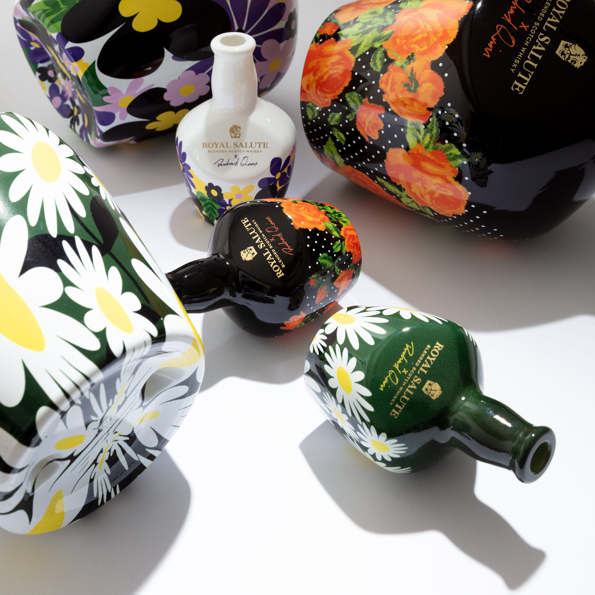
See recent travel-retail-ready work: Plymouth Gin × Ocean Trust · Royal Salute Fashion Edition · Bvlgari Le Gemme Tygar × Refik Anadol
Come hold one. Start with a sample →