Clear glass is a design choice. So is everything else.
Coating gives wine and spirits brands direct control over what the bottle communicates — before the label is read, before the liquid is tasted.
A bottle on a shelf has about two seconds. The finish is what gets used.
Not the label copy. Not the brand story. The immediate, pre-conscious read of the surface — glossy or matte, opaque or translucent, vibrant or restrained — is what determines whether the bottle reads as premium, as interesting, as worth picking up.
Most brands treat this as a glass factory decision. It is not. It is a decoration decision. Glass bottle coating is the technique that makes the full range of finishes available — on standard clear glass, without touching the mould.
A finish that follows the form.
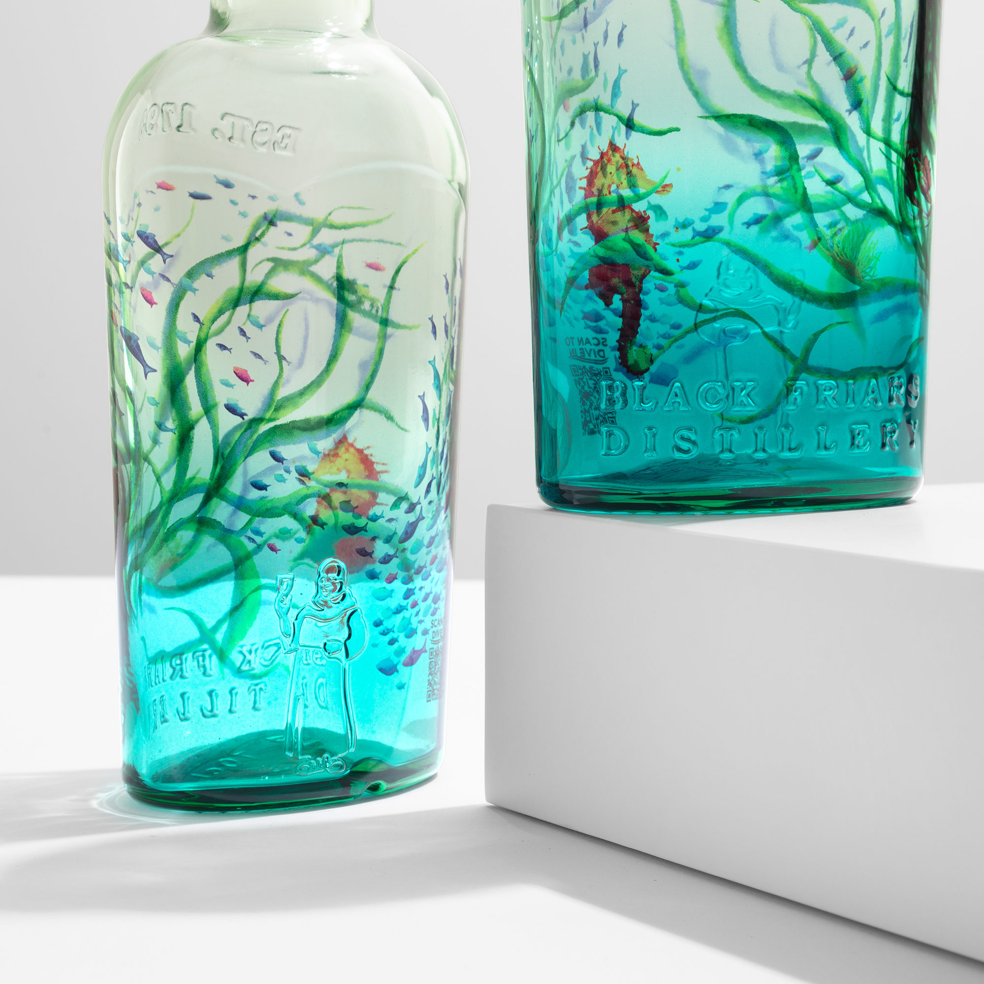
Screen printing works best on flat surfaces. Labels have application limits. Foil needs specific geometries. Coating is applied as a liquid — it follows the form of the bottle wherever the form goes.
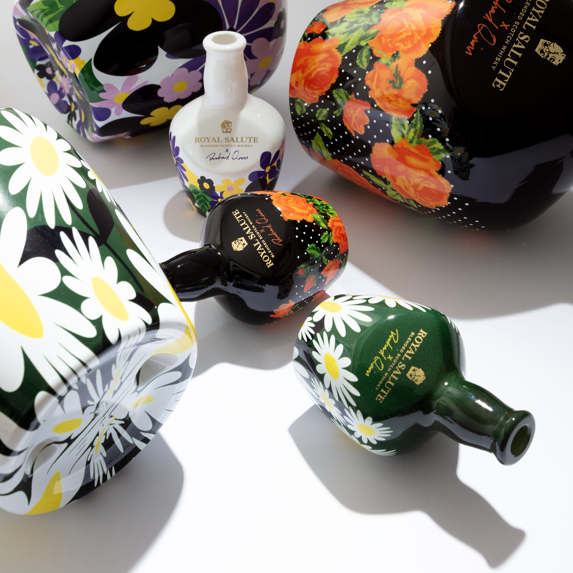
This matters most at the difficult points of a bottle’s geometry: the heel at the base, the shoulder where the neck begins, recessed panels, curves that tighten. These are the areas other decoration techniques struggle to reach consistently. Coating covers all of them in a single pass, with the same finish quality as the main body.
For bottles whose shapes are part of the brand identity — and that is most premium wine and spirits packaging — this is not a minor technical footnote. It is the difference between a decoration that honours the design and one that compromises it.
The finish is the positioning.
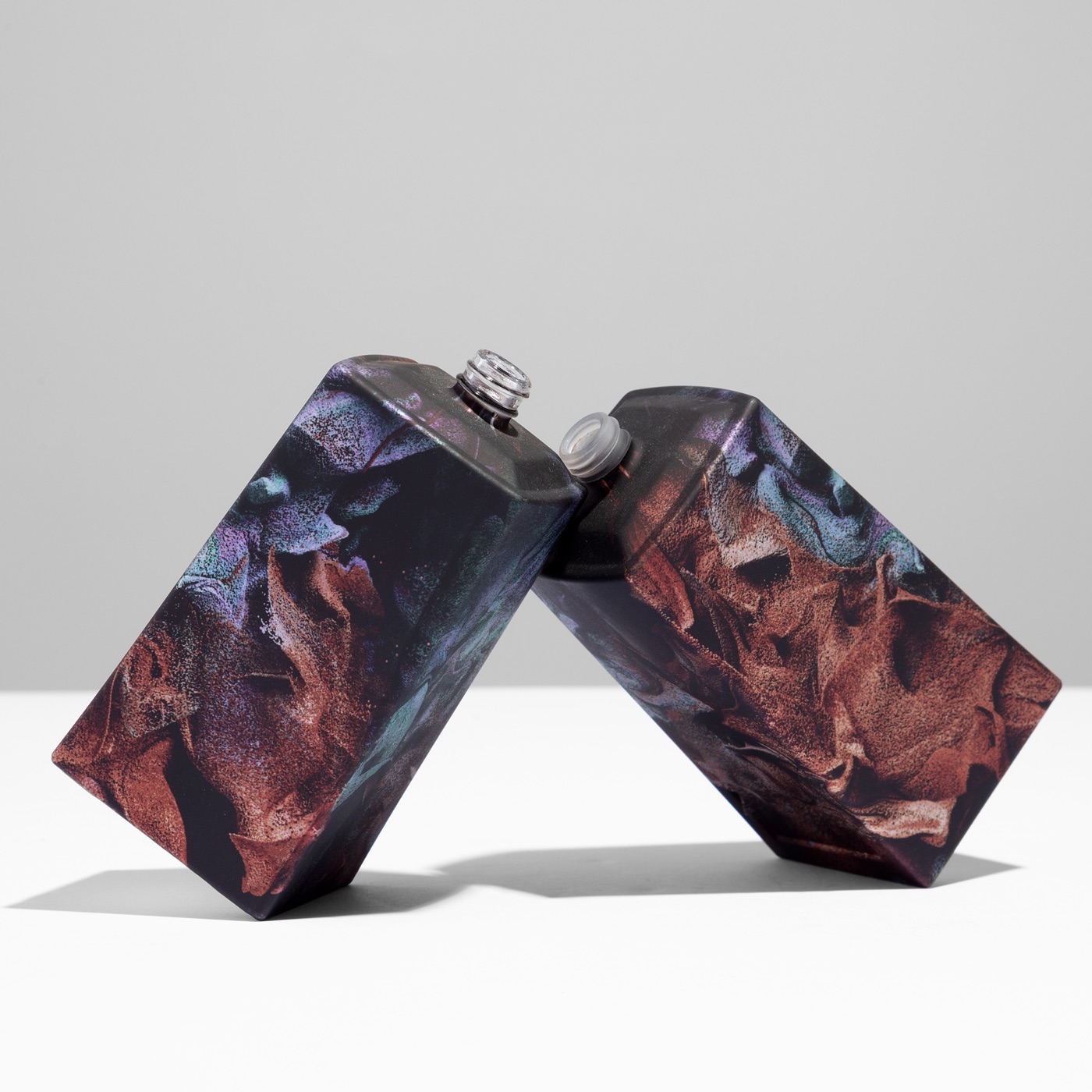
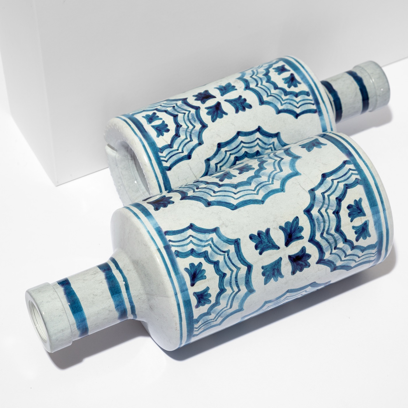
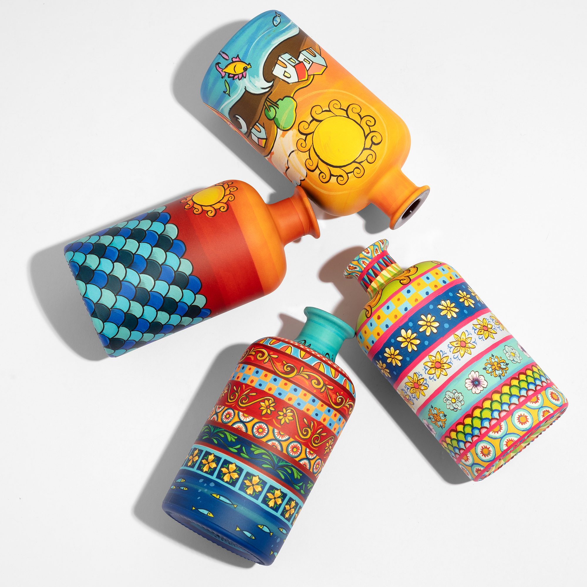
Matte reads as confident and considered. Gloss signals intensity and presence. Satin sits between the two — tactile, soft, associated with craftsmanship rather than performance. Ceramic-like finishes make glass read as a different material entirely: dense, weighty, design-led. Translucent effects preserve the visual quality of the glass while adding colour depth that bare glass cannot achieve. Metallic effects and soft-touch coatings extend the range further, into territory that belongs to the hand as much as the eye.
These are not production parameters. They are positioning decisions. A vibrant opaque coating on a spirits bottle is a direct play for shelf visibility. A soft-touch matte on a premium wine signals that someone thought carefully about the object. A ceramic finish on an olive oil bottle moves the product out of the commodity category in a single visual gesture.
None of these finishes can be produced during glass manufacturing. They require decoration. And coating, applied at industrial scale with consistent output across every bottle in a run, is how they become real.
Coverage is a creative variable.
Coating does not have to cover the whole bottle. This is one of its least discussed advantages.
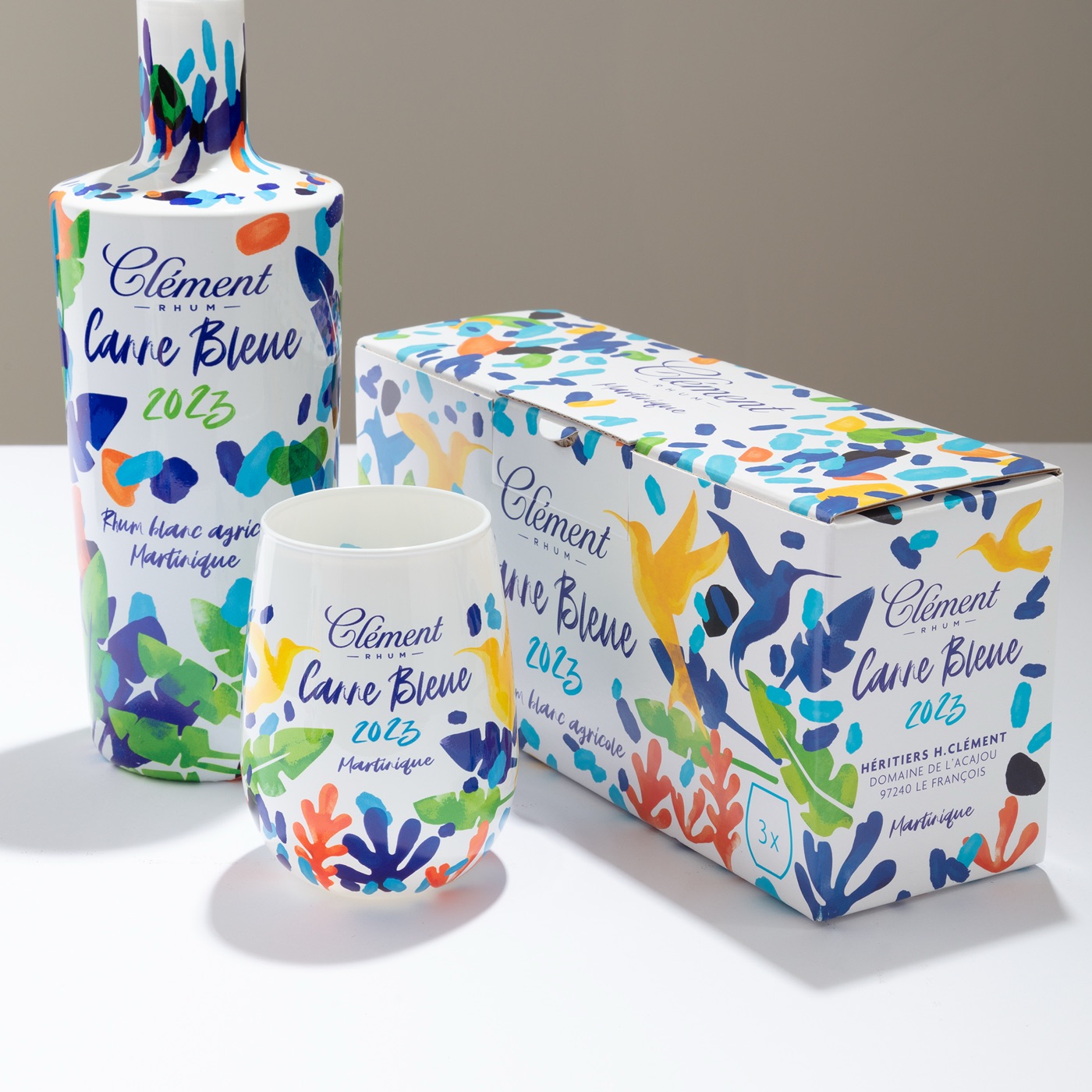
A gradient application — colour that transitions from solid at the base to transparent at the shoulder — creates movement across the bottle without touching the shape. A partial coat, covering the lower half while leaving the upper portion in clear glass, reads as a deliberate design decision rather than an incomplete one. Full coverage at high opacity turns the glass into a canvas of solid colour, vibrant in ways that would require exotic glass formulations to replicate in the material itself.
These options exist within the same production process. The brand decides the coverage; the application follows. And unlike changing the glass mould, changing the coverage is a brief revision, not a tooling investment.
One of the largest coating lines in Europe.
A finish is only as good as its repeatability. The matte that won the design approval has to be the same matte on every bottle, in every batch, months apart.
This is where coating stops being a creative exercise and becomes an industrial one. ATIU operates one of the largest glass coating lines in Europe, at its plants in Verona — built for spray coating at volume, with controlled curing and colour consistency from the first coated bottle to the last. Wine and spirits brands work to launch dates and allocation windows; a coating partner has to hold quality at the speed of those calendars.
Scale changes the creative conversation too. When the line is large enough, a gradient trial or a colour revision is not a disruption to production — it is a normal day. Brands can explore finishes the way they explore label designs, because the capacity to test, refine and then run at volume sits in one place.
With a label or without.
Coating and labelling are not competing choices. A coated base — matte or satin, in the brand’s primary colour — gives the label a surface that elevates rather than undermines it. Clear glass beneath a label is a neutral backdrop. A considered coating is a frame.
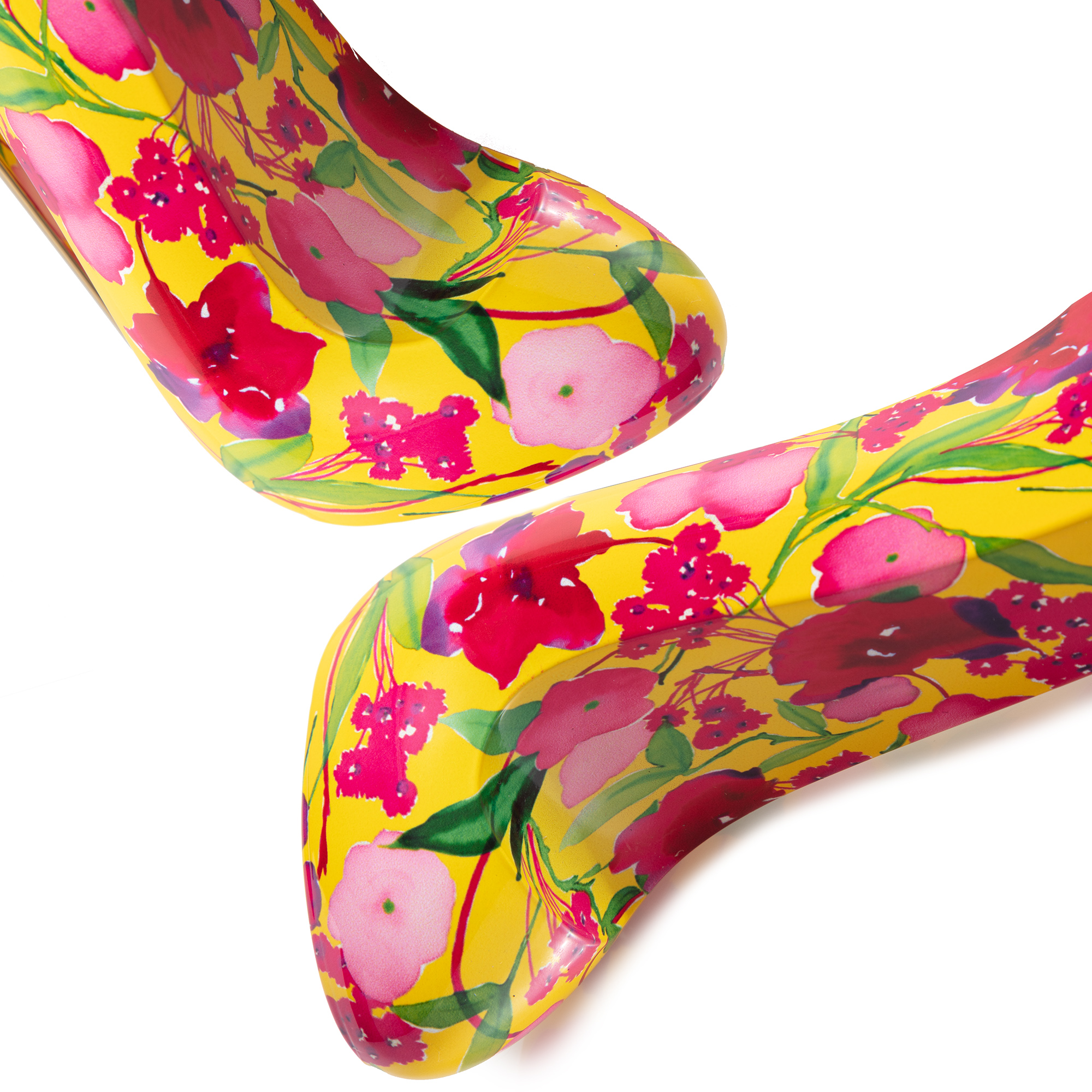
For brands that want to go beyond solid colour, digital sublimation extends the possibilities further: HD artwork, gradients and full-body printing at 1,200 dpi. The two techniques complement each other, and many of the most ambitious projects use both — coating for the base finish, sublimation for the artwork.
For the technical side — coating types, application processes, performance — see our industrial guide to glass bottle coating. The decision, though, starts with the brief, not the technique. Bring the bottle, the positioning, the market. The finish follows from there.