Bvlgari Le Gemme Tygar × Refik Anadol
Two materials. Two shapes. One unbroken artwork.
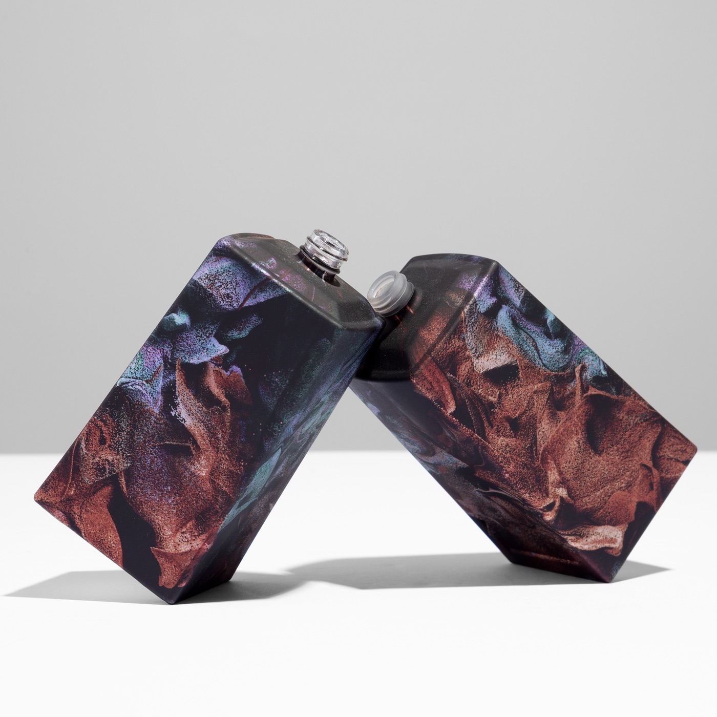
Refik Anadol's medium is data and light. Bvlgari asked him to create the visual identity of Le Gemme Tygar — and then refused to simplify what he delivered. The result is not a label on a bottle. It is a work of digital art that happens to contain a fragrance.
Anadol is one of the most recognised digital artists working today. His large-scale installations have been shown at MoMA and sold at Christie's, and his work does not behave like graphic design: it moves, it shimmers, it dissolves one colour into the next without ever settling into a flat, printable palette. For Le Gemme Tygar, his studio created an original artwork — fluid, iridescent, shifting — that became the entire visual language of the packaging, and the perfume formula itself informed the colour palette. That is the starting point of this case study, and it is also its central problem. An artwork made of reflective colour, of what could be called infinite pixels, of shades that belong to the artist and to no standard colour system, had to leave the screen and live on a physical object. And not a simple one.
An artwork that could not be simplified
This was a digital art project in the strictest sense: the decoration had to run all over the object, including the angles of a very complicated flacon geometry. There was no safe zone to retreat to, no front panel to decorate while leaving the difficult surfaces plain. Anadol's aesthetic demanded a decoration with no limits of colour and no limits of shades — every gradient, every transition, every tone the artist had composed had to arrive on the flacon exactly as he made it. The artwork could not be simplified, separated into spot colours, or approximated by a close-enough reproduction. That is why sublimation was the enabling choice: a process that reproduces full-colour, continuous-tone imagery at up to 1200 dpi, wrapping the complete geometry of the object rather than a printable window on it. Sublimation did not adapt the art to the object. It let the object carry the art.
The primer as the luxury decision
Beneath the artwork sits a choice that most people holding the flacon will never name, but will immediately feel. Bvlgari selected a particularly premium metallic primer finish that is also soft-touch — one of the multiple primer finishes in ATIU's range, and among the most demanding of them. The metallic base gives Anadol's colours their reflective depth: luminosity that shifts with the angle of light, iridescence that echoes the movement of the original digital compositions. The soft-touch surface adds the tactile dimension, a warmth under the fingers that glass alone does not offer. The user experience of Le Gemme Tygar lives exactly there, between the tactile effect, the light and iridescence, and the full-colour wrap of the artwork itself. It is a reminder that in luxury decoration the primer is not a technical preliminary — it is a creative decision, and here it was made with the same ambition as the artwork above it.
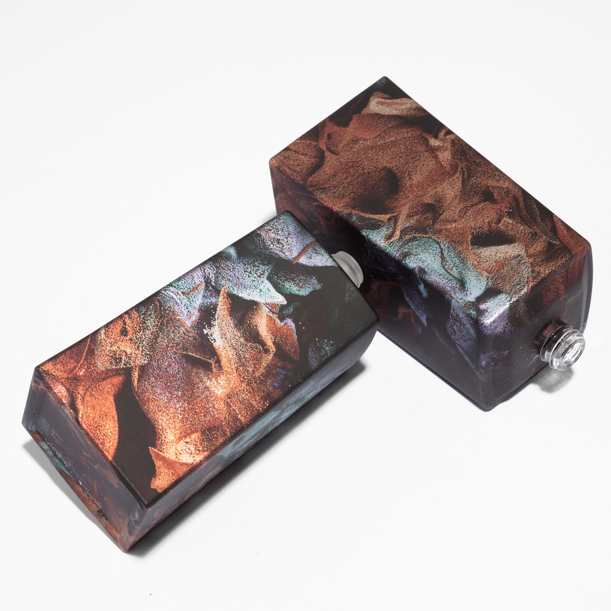
One continuum: glass and zamac
The decisive technical feat of the piece is the cap. A glass flacon and a zamac cap: two very different materials, with very different weights and very different thermal behaviour. Ennobling the zamac cap and matching it completely to the glass — same primer character, same colour fidelity, same surface feel — meant making two components behave as one canvas. The artwork runs from cap to body with no break at the join: one continuous composition, with colour and registration held steady on glass and metal alike. Pick up the finished flacon and there is no moment where the art stops and the hardware begins. Two materials, two shapes, two weights, one continuum presenting the artist's work without interruption.
Months with the artist, one week in production
The timeline of Le Gemme Tygar tells you where the real work lives. Development took a few months of back-and-forth with the artist's studio — colour targets read against screens rather than swatches, the metallic depth and the soft-touch surface tuned until the glass behaved like the moving image it came from. Production, once every shade was approved, took about one week. The interlocutors were the brand itself and its component suppliers, with the artist's studio in the loop throughout: an orchestra, with the brand at the centre and the product as everyone's first priority. It is how ATIU prefers to work — openly, alongside the industry's other players — because a strictly limited edition of this ambition is only possible when every stakeholder plays on the same score.
What this proves
Bvlgari refused to compromise. They envisioned a fragrance where every surface — glass and zamac, body and cap — would carry the artist's vision without interruption, and that ambition demanded a decoration partner who could make it seamless across both materials. The piece was awarded at the Formes de Luxe Award 2025. For creative directors, the lesson reaches beyond one flacon. It is the kind of result that co-creation in perfumery packaging makes possible — artist, brand, glassmaker, cap maker and decorator working on the same object from the first render onward, following a concept-to-shelf path where the design is never trimmed to fit the process. If an artwork made of data and light can wrap a complicated geometry across glass and zamac without losing a single shade, the practical conclusion is simple: whatever you can design, it can be made real.
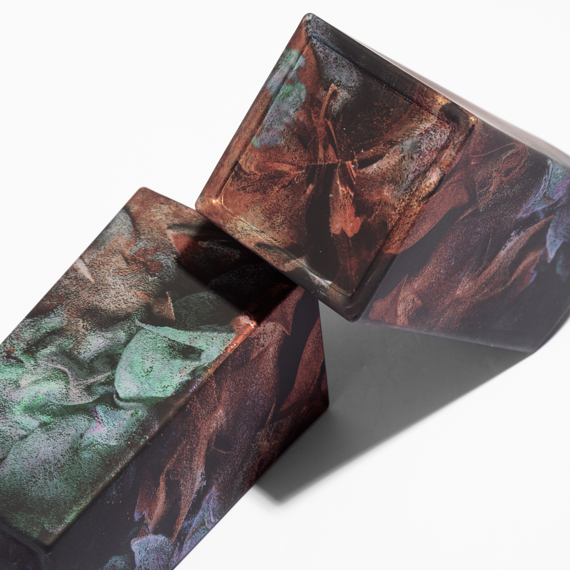
Glass and zamac, unified. The art flows uninterrupted.
Source
Explore our sublimation technology or get in touch for your project.