Concept to Shelf: How Decoration Turns Glass Into a Brand
A glass bottle, before anyone touches it, is a commodity. It is a shape any brand can order from a glassmaker, moulded to a spec, interchangeable with a thousand others on the same production sheet — clear, empty, waiting. What separates one bottle from every other on the shelf is not the glass. It is the decoration. Decoration is the moment a commodity becomes a brand: the only part of the object a shopper actually experiences, the surface that carries the name, the colour and the world the brand has built. This is the story of that transformation — from a brand's first idea and its chosen mould, through design and sampling, to a finished bottle produced at industrial scale and standing on a shelf in Tesco or Eataly. At ATIU, that story runs on sublimation on glass, and it begins the moment the brand's own glass arrives at our two plants in Verona, Italy.
Glass is the commodity. Decoration is the brand.
Start with what glass actually is in a brand's supply chain. A brand chooses a glassmaker, specifies a volume and a form, and receives thousands of identical vessels. Unless the shape is a tailor-made mould the brand has commissioned for itself, every competitor can order from the very same catalogue. At that stage the bottle carries no meaning: it is a beautifully made commodity, and commodities are, by definition, interchangeable. Two clear flint bottles from the same catalogue mould are the same object no matter whose spirit or fragrance eventually fills them. The glass is the input, and inputs do not build brands. This is the honest starting point of every premium packaging decision, and it clarifies exactly where a brand's value is really created.
Decoration is where that changes, and it changes completely. The instant an artwork is fused onto the surface, the commodity stops being interchangeable and becomes unmistakably one brand's own — the colour it chose, the illustration it commissioned, the type it drew, wrapping the object a shopper will pick up. This is not a cosmetic afterthought layered onto the real product; on the shelf, the decoration is the product the eye meets first and the hand reaches for. Fill and function live inside the glass, but recognition, desire and memory live on its surface. Everything that makes a bottle feel like a hundred euros rather than ten lives in that thin, decorated layer. That is why decoration is the premiumisation: it is the step that turns a bought-in vessel into an asset the brand owns outright.
It matters, too, that the brand provides its own glass and ATIU's work begins there. We do not make glass — we decorate it. That division is the whole point of the arc: the brand and its glassmaker settle the commodity, and everything that makes the bottle a brand happens afterwards, on the surface, in Verona. The bottle arrives correct, clean, capable and completely anonymous, and it leaves as an object no competitor could source from the same catalogue. Keeping those two things cleanly separate is what lets a brand think clearly about where its value is actually created. The mould is a foundation any competitor could share; a bespoke mould is the one exception. The decoration is the part no one else can have.
The special mould is where sublimation belongs
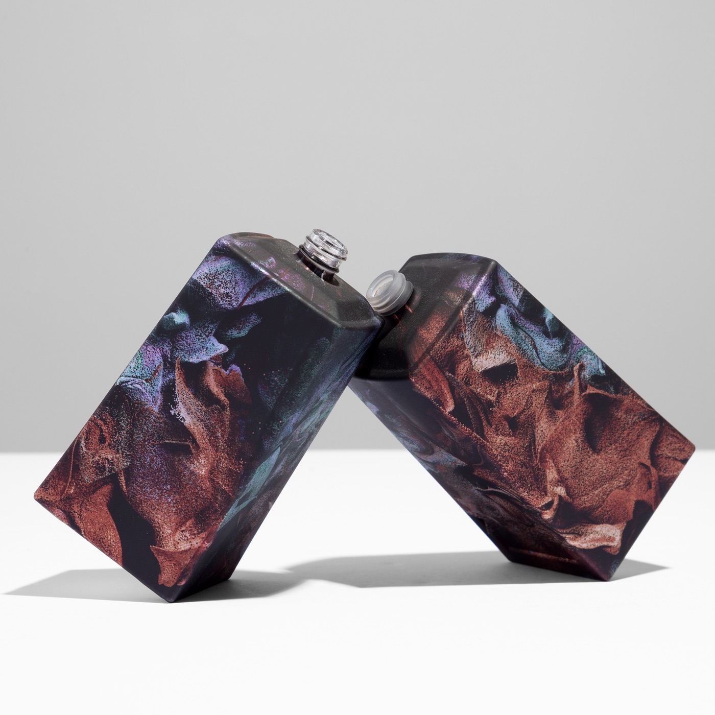
Some brands go further than the catalogue, and they are right to. They invest in a special, sculptural, distinctive mould, because a silhouette is the fastest thing a shopper reads — it registers across an aisle before the name is legible or the colour resolves, before any other signal has a chance to speak. A shape works at a distance, in a photograph, in a split second of peripheral vision, and it earns attention in the moment that decides whether a hand moves. That is why a distinctive shape is one of the most valuable and most considered things a packaging team can commission. The more ambitious that silhouette, the more a brand has staked on it — and the more it deserves a decoration method built to honour every millimetre of it. This is exactly where sublimation on glass belongs.
Sublimation is uniquely built for ambitious geometry, because the image is not printed onto a flat panel and wrapped as an afterthought — it is fused into a waterborne primer and follows the form itself. It travels a tapered waist, a curved shoulder, a concave face, a full 360 degrees from base to neck, with no seam and no blind spot, at up to 1200 dpi. Where a shape narrows or bends, the artwork narrows and bends with it, continuous and complete across every plane. The more sculptural and distinctive the mould, the more sublimation has to work with, and the more completely it can personify that shape into an icon rather than merely covering it. A brief that once felt too ambitious to realise on glass becomes the very kind of brief sublimation was made for. The harder the mould, the more it rewards.
So the relationship between shape and surface is a partnership, never a compromise. A brand that has invested in a remarkable silhouette wants that investment fully expressed — every curve carrying artwork, every angle part of the design system — and sublimation gives it exactly that. The shapes a brand cares most about are precisely the shapes this technology is happiest with. The result is not a decorated bottle but a designed object, whole from base to neck, that looks and feels inseparable from the brand it represents. A sculptural bottle stops being something to design around and becomes an invitation to wrap.
From concept and sampling to the finished object
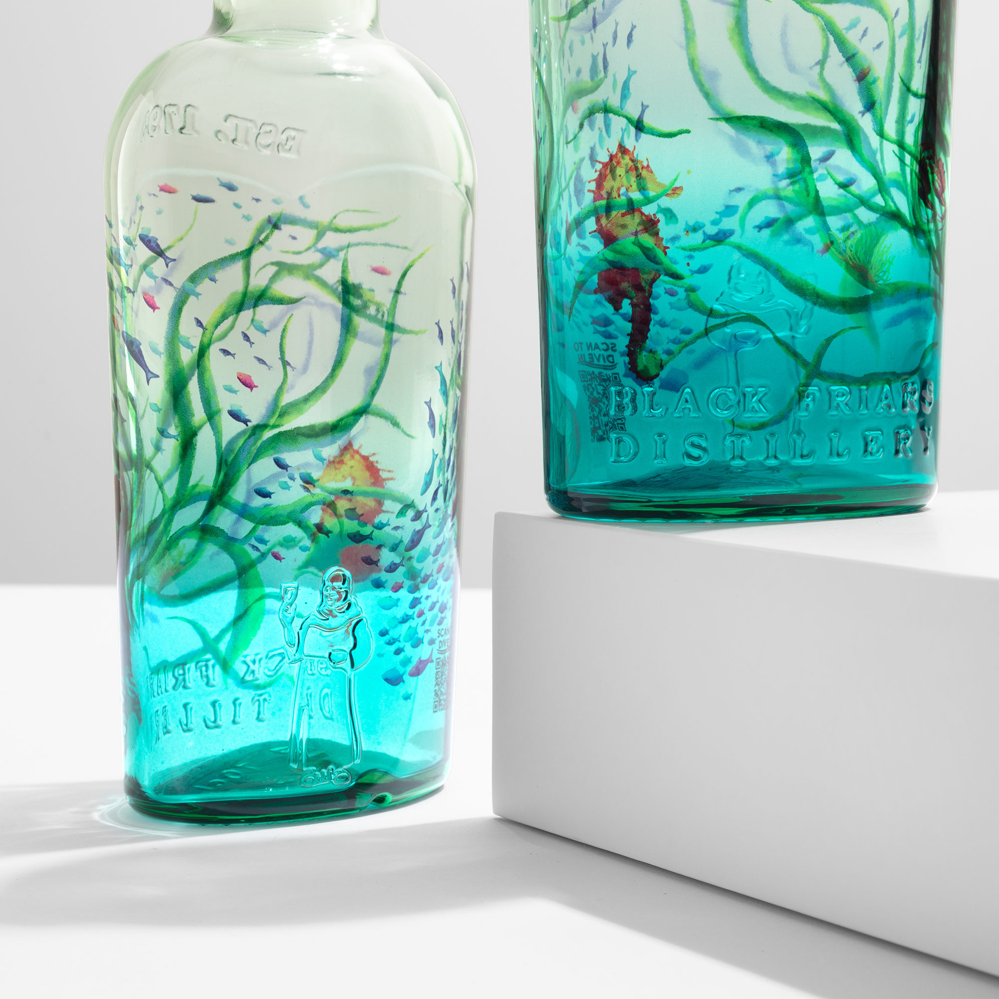
The arc from idea to shelf is short, and it holds true to the original idea at every step. It begins with a brief and a chosen mould: the brand's world, its palette, its story, and the glass it has decided to use. It moves into design, where the artwork is prepared exactly as it will appear on the object — full-body imagery, gradients, fine serif type, hundreds of colours if the design calls for them, all resolved for a true 360-degree wrap rather than a single printable face. Because sublimation is plate-free, screen-free and fully digital, pricing is independent of colour count: a single-colour design and a full-spectrum HD design cost the same to decorate, and Pantone targets are matched through calibrated CMYK. A creative director is free to choose the most expressive artwork rather than the most economical one. What is imagined on screen is what reaches the shelf, and it moves from concept to prototype in a matter of days.
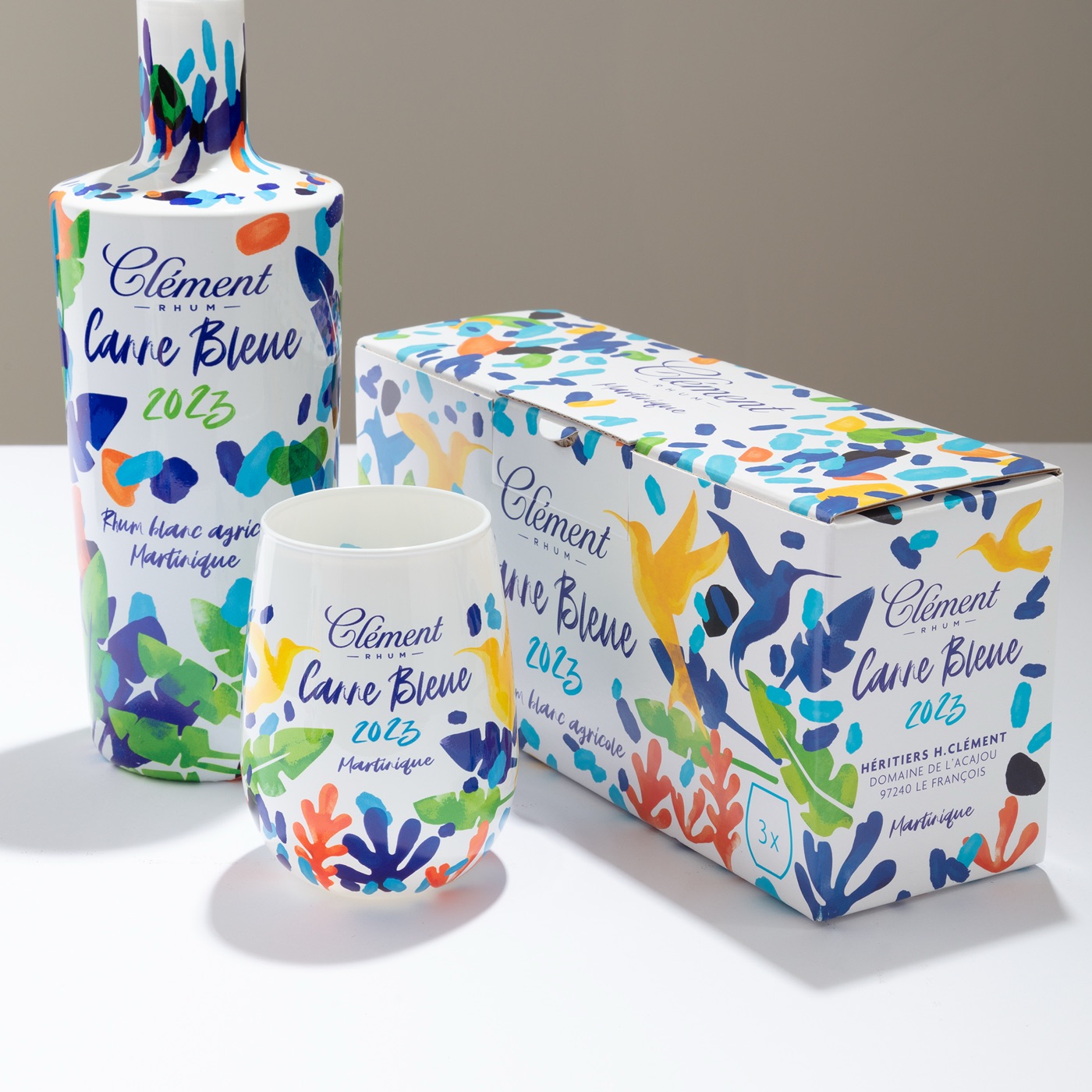
The primer is the first creative decision, because the same artwork reads as a different object on each of eight base finishes. A clear primer lets the glass breathe, as it does on Plymouth Gin; a metallic soft-touch matte transforms the surface in the hand, as it does on Bvlgari. That single choice can turn one design into several completely different objects before a single ink is placed. Sampling then closes the loop between imagination and reality: because there are no plates or screens to cut, a real decorated bottle — the actual mould, the actual artwork, the actual finish — can be in a brand's hands quickly, so decisions are made against a physical object rather than a screen proof. Concept becomes prototype, and the brand sees its idea on real glass before committing to a run. The design system extends beyond the bottle, too, because the same process runs on aluminium, zamac and ceramic — so a bottle, its cap and its collar can all speak one visual language.
Then the object is produced at scale, and the standard holds from the first bottle to the last. The brand's glass is primed and decorated on one integrated line in Verona, from editions of 5,000 pieces up to several million units per project, at up to 4,000 bottles an hour, with curing that never rises above 180°C. The HD standard a brand approved on its sample is the same standard that reaches the final bottle of the run. Because the decoration is everything the shopper sees, a brand can specify lighter, thinner glass and keep the same shelf presence — a smaller footprint for the same impact. And because the process is digital, a new edition, a seasonal variant or a market-specific design is a new file, not a new tooling programme: when the story changes, the brand changes the artwork, not the line.
One advantage deserves to be called out on its own, because it protects everything the brand has built. The decoration is inseparable from the bottle: everything is printed on the glass itself — no applied label, no wrap, no separate carrier — so the artwork bonds permanently into the primer and becomes part of the surface. That makes it tamper-evident and extremely hard to counterfeit, because the decoration cannot be peeled away, swapped or convincingly reproduced by a third party. For premium spirits and perfumery, where the grey market and counterfeiting carry a real commercial cost, a finish that is fused into the glass is a genuine safeguard — for the brand's revenue, for its reputation, and for the customer who wants to know the bottle in their hand is the real thing.
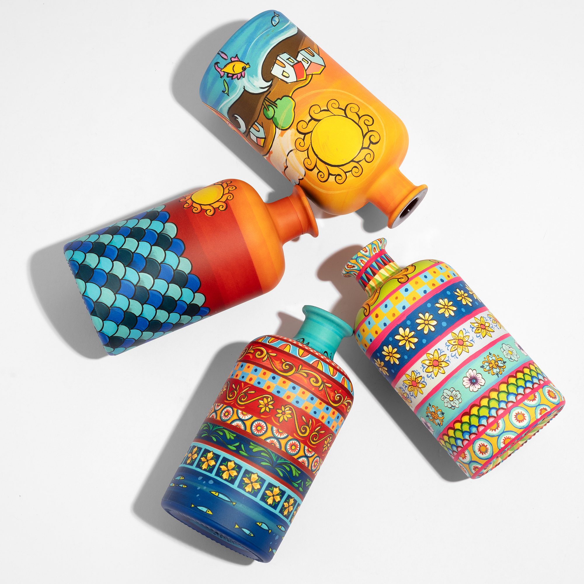
The ceramic effect, at industrial scale
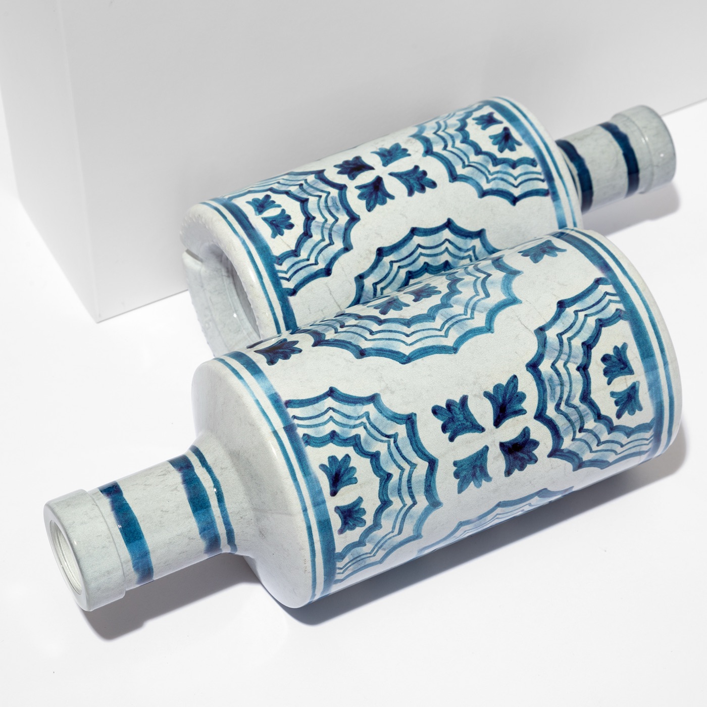
One of the most striking things sublimation on glass makes possible is a finish that used to belong only to the artisan's workshop: the look of glazed, hand-painted ceramic — majolica — reproduced across a whole glass form. A matte primer combined with sublimation recreates the depth and warmth of hand-painted glaze, but on recyclable glass and at a scale no hand-painting studio could ever reach. This matters because it collapses an old trade-off. Brands no longer have to choose between the soul of a handmade object and the consistency, availability and volume an international rollout demands. The artisanal look and the industrial order become the same thing, produced to a single standard from the first bottle to the last, ready for orders that ship across markets.
The proof is Centonze Ice Blue. A complete Sicilian majolica design was reproduced across an entire glass form in a single pass — the glazed ceramic look, the pattern travelling around the full body of the bottle, all decorated on glass. It won Pentawards Gold 2025 in Sustainability, external recognition rather than a marketing claim, and it stands as a decoration achievement: majolica-on-glass, delivered at the quality and volume a modern brand needs to sell through international retail channels such as Tesco and Eataly. It shows what the concept-to-shelf arc looks like when it lands — an idea rooted in craft, realised on a commodity material, and made repeatable enough to fill shelves at scale. The showpiece and the shipment become one and the same object.
Beauty, sustainability and the shelf
The transformation from commodity to brand does not come at an environmental cost, and that is increasingly part of what premium means. No plastic is added to the bottle. The coating and the inks are both waterborne — no solvents — and free of heavy metals, and curing never rises above 180°C. Because the decoration is a minimal surface layer fused into a thin primer, the glass underneath stays recyclable rather than becoming a mixed material that is harder to recover. Sublimation is also the ideal way to ennoble lighter, thinner glass: more shelf presence and a smaller footprint in the same decision, rather than a choice between them. ATIU has operated zero-net carbon since 2023, is EcoVadis Committed and ISO 9001 certified, and the Pentawards Gold in Sustainability is external proof rather than a marketing line.
Put the whole arc together and the logic is simple. Glass is a commodity a brand buys — unless it has commissioned a bespoke mould of its own; decoration is where that commodity becomes the brand and, when the mould is special, becomes an icon. It is the part of the object the shopper actually holds, the part that carries recognition and desire, the part no competitor can source from the same catalogue. From a brief and a chosen mould, through design and sampling, to a finished bottle produced at industrial scale, sublimation on glass keeps nothing standing between the idea and the object. The bottle is the brand, the decoration is where the brand lives, and this is the process that carries it from a concept all the way to a finished icon on the shelf. Send a brief or request a sample, and see your concept on real glass in a matter of days — your bottle, your artwork, your volumes.
See how sublimation on glass works, or request a sample.