Plymouth Gin × Ocean Conservation Trust
230 years old. Still making waves.
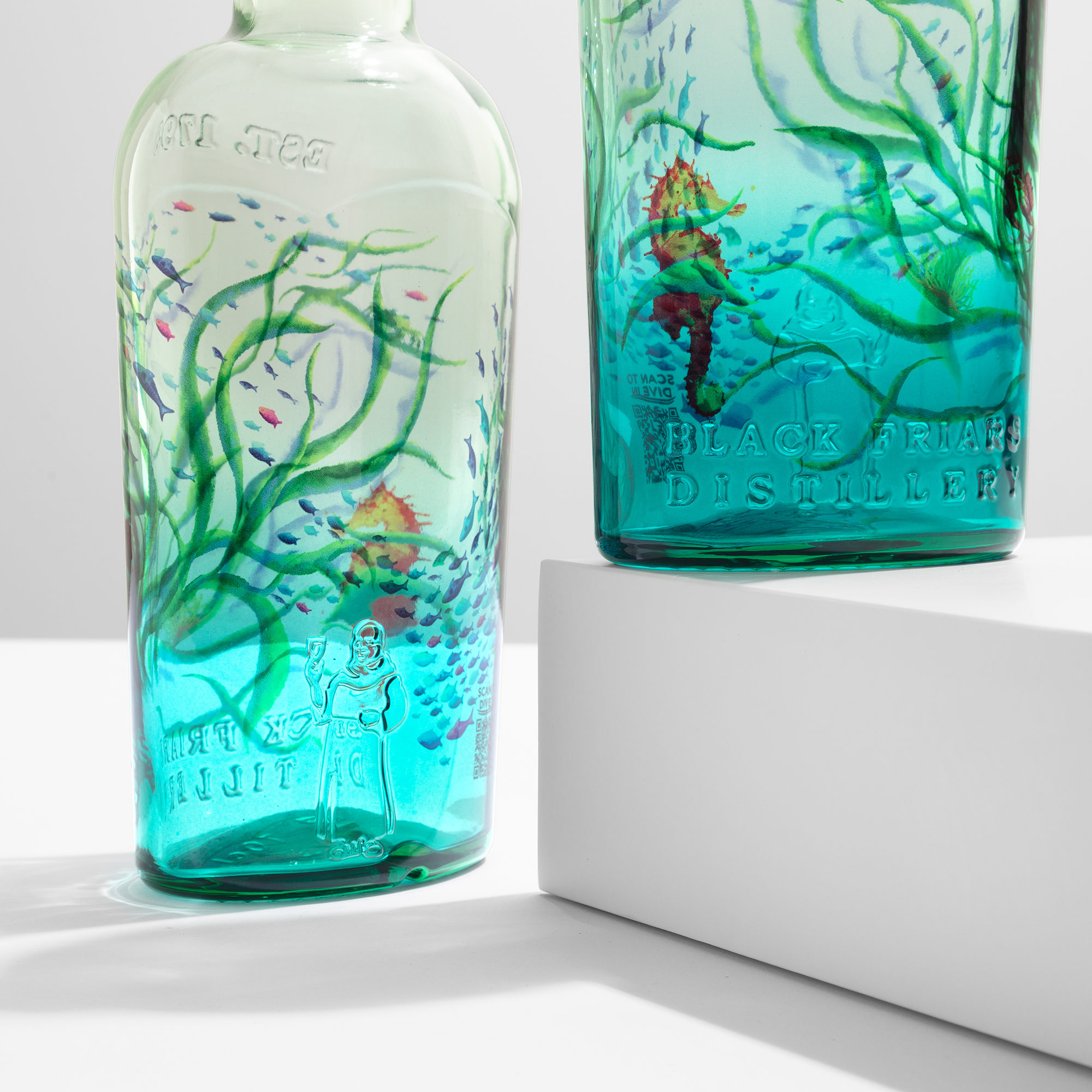
Plymouth Gin is one of the oldest gin distilleries in existence — 230 years of history from the same Barbican distillery overlooking Plymouth Sound. This is, quite literally, a gin with the ocean in its name. So when the brand partnered with the Ocean Conservation Trust, the brief was never going to be an ordinary limited edition. Every bottle of the Ocean Edition sold funds the regeneration of seagrass, one of the most endangered marine habitats on the planet. The bottle is not packaging that carries a message — the bottle is the message. And that changed everything about how it could be made.
A bottle that funds something real
The Ocean Edition has grown across three consecutive years, and each year the ocean has moved closer to the surface of the glass. Year 2 introduced a blue-tinted bottle that turned the sea itself into a design element, the artwork floating over the colour of the water. Year 3 went further — a vibrant underwater scene that wraps the entire bottle, bringing seagrass meadows and the life they shelter into full colour. The design tells the story of exactly what the donations protect: seagrass beds capture carbon 35 times faster than rainforests and support 80,000 fish per hectare, and so far the partnership has helped regenerate 20 hectares of them. Creative direction across all three years comes from Boundless, the agency that has shaped the Ocean Edition's visual identity from the start. The result is a rare thing in spirits packaging: a limited edition where the decoration is not an aesthetic layer on top of a cause, but the cause made visible.
When the object cannot contradict the message
Here is the constraint that made this project different from almost any other brief: the artwork carries a conservation message, so the object carrying it could not contradict it. A bottle that funds the regeneration of a marine habitat cannot be decorated with a process that works against the same logic. For this project, a completely sustainable decoration was not a preference. It was essential. That is why Plymouth chose ATIU: not because sustainability could be added to the production, but because it was already there, built into how the company works — the thinking is set out in our guide to sustainable glass bottle decoration.
ATIU answered on every layer of the decoration. The decoration itself is recyclable: it is a minimal surface layer with no sleeve, no adhesive label and no plastic added to the pack, so the glass stays glass and the finished bottle remains fully compatible with standard glass recycling streams. The materials are waterborne only, with zero heavy metals. The curing temperature is very low — never above 180°C — keeping the energy footprint of the decoration itself contained. And the company behind the process has been carbon-footprint zero since 2023, verified across Scope 1, 2 and 3, with all emissions offset, alongside EcoVadis Committed status and ISO 9001 certification. Layer by layer — material, process, company — the decoration holds to the same standard as the cause it serves.
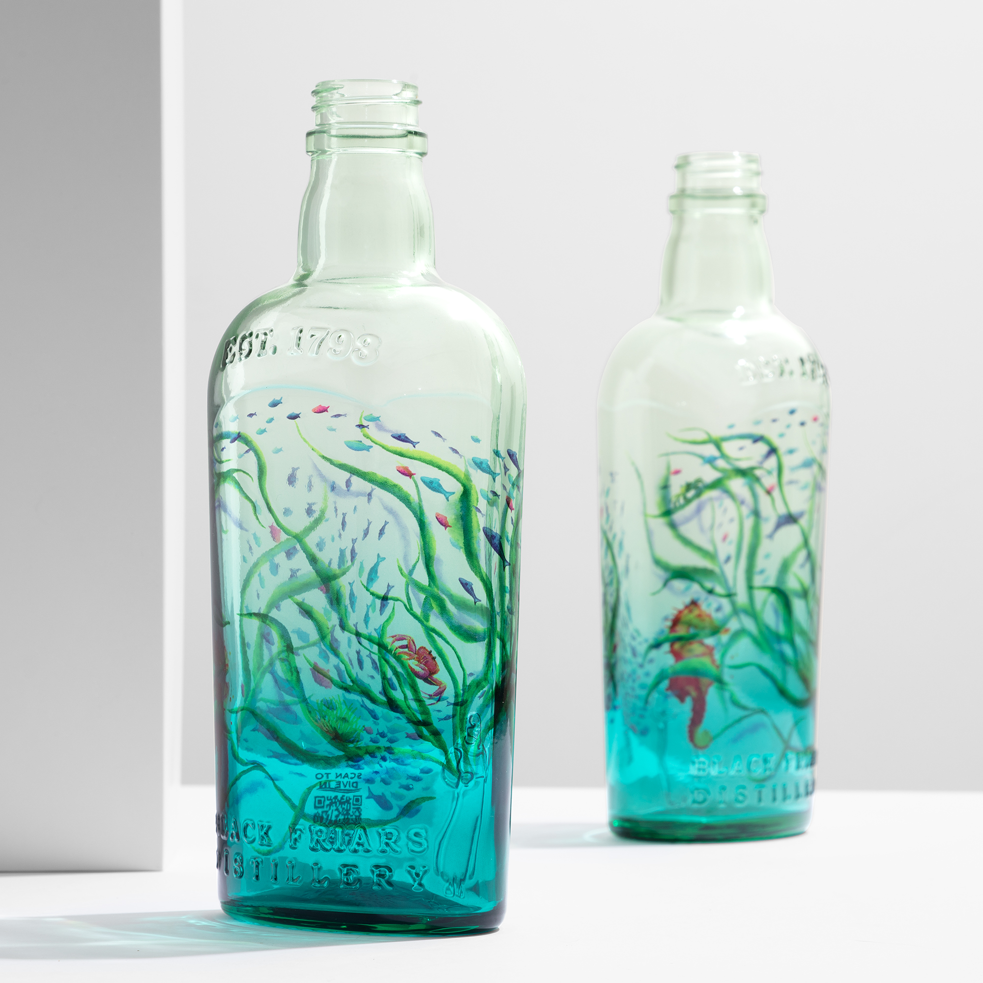
The bottle is stunning, completely unique — and factually sustainable. Not a marketing point. The reality of things.
Two years of editions
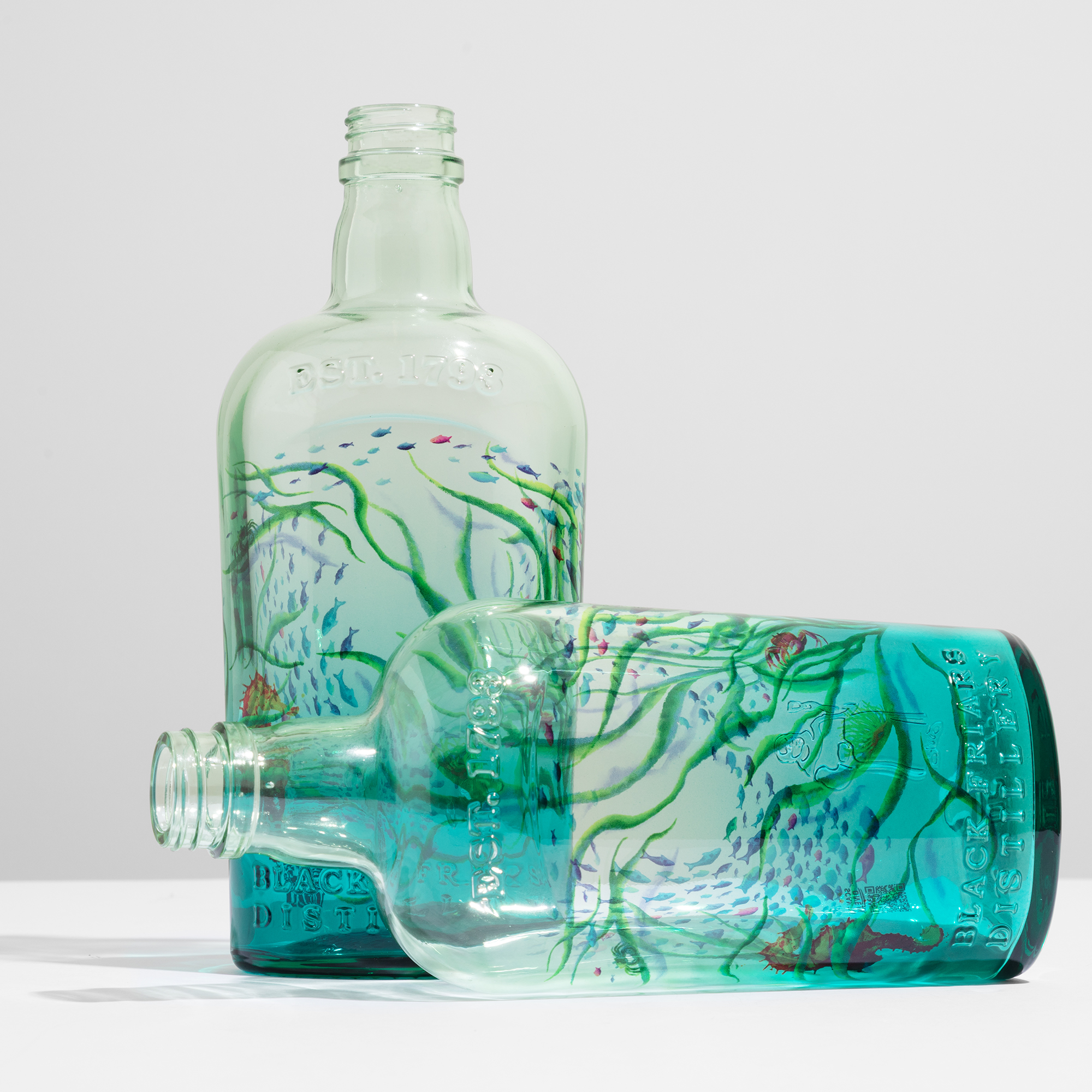
This is not a one-off. ATIU has decorated the Ocean Conservation Trust editions for two years running — the Year 2 and Year 3 bottles — a continuing collaboration in which the standard set the first time had to be met, and then extended, the next. Both editions were decorated by sublimation on glass: full-body HD artwork with true 360° coverage, base to neck, on the Plymouth bottle's distinctive silhouette. A full-wrap composition on that shape is demanding work — the artwork has to stay continuous and correctly proportioned as the glass curves and the diameter changes, so the underwater scene reads as one uninterrupted world from every angle the bottle is picked up and turned. The choice of a clear primer was just as deliberate. It allows the decoration to sit on the surface while keeping the glass itself visible, so the blue tint of the Year 2 bottle and the liquid behind the artwork remain part of the design rather than disappearing behind it. Colour, depth and detail are set into the surface in a single thermal process, and the result is a bottle that carries the ocean on its skin without hiding what is inside.
The Plymouth silhouette adds one more complication the finished bottle hides well: the glass carries an embossing, and the artwork covers it completely — the relief is decorated over and woven into the underwater scene rather than left as an island in the design. It is the kind of brief that is, honestly, not complex for sublimation and simply out of reach for the technologies a limited edition would normally lean on: a label, a sleeve or a screen print cannot wrap the whole bottle, keep the transparency that lets the gin itself read as sea, and absorb an embossing, all at once. Here the constraint list was the argument for the process.
Three months to develop, weeks to produce
Each edition followed the same rhythm: around three months of development — artwork adaptation with the agency, colour proofs against the blue-tinted glass, approvals — then production in a few weeks, at the tens-of-thousands scale a distribution of this reach requires. Before release, the decoration passed the battery a working spirits bottle is expected to survive: cross-cut and tape adhesion tests, immersion in gin and in water, and the ice-bucket test that every bar eventually runs for real. The inks, like the coating, are waterborne — so the decoration holds the same line as the rest of the pack: nothing added that isn't compatible with the glass it protects.
Sustainability and design: the same decision
The Ocean Edition proves a point that matters well beyond one gin. The decoration on these bottles is sustainable per se — recyclable, waterborne, cured at low temperature — but the deeper truth is that ATIU has sustainability at its core, and reaches for it without jeopardizing design. Nothing about these bottles was simplified to earn their environmental credentials. The bottle is stunning, completely unique, and factually sustainable, all at once — and that is not a marketing point, it is the reality of things. For a brand whose bottle had to embody its cause, that alignment was the entire brief. For every other brand watching, it is the demonstration that choosing a sustainable decoration and choosing a beautiful one are not two decisions. They are the same one.
Sources
Plymouth Gin — Make Waves · World Brand Design
Read ATIU's approach to sustainability, explore spirits bottle decoration or get in touch for your project.