Spirits bottle decoration, reimagined.
A super-premium Scotch lands on a shelf in Mayfair. The glass doesn't carry a label. It carries a full-bleed fashion print, wall to wall, neck to base. That is the shift. A decade ago, a luxury spirit was a liquid with a label on top; today, in the premium category, the bottle is the design, and the whole object has to be worth the price of entry. This is a working guide to where premium spirits bottle decoration is going across whisky, gin, vodka, rum and agave — and why the brands leading the move are moving to digital sublimation on glass.
The brief has changed
Three things are putting pressure on the spirits decoration brief at the same time, and it is their simultaneity rather than any single one that is moving the category. The first is that the shelf got louder. Premium spirits used to compete only with premium spirits, but now they compete with the entire category of luxury objects a wealthy customer could buy for the same money — a watch, a fragrance, a small piece of design. The bottle has to earn its spot on a bar cart, a display shelf, a gift moment, and a good label alone is no longer enough to do that. The whole object, from the silhouette to the surface, has to make the argument for the price.
The second pressure is that creative directors got ambitious. Brand teams inside groups such as Pernod Ricard and LVMH, along with the independent super-premium houses, are bringing in fashion collaborators, contemporary artists and generative artwork. When the art is that good, the decoration technique cannot be the bottleneck. The brief is asking for a canvas, not a frame. The best work of the year deserves to wrap the whole silhouette, not sit inside a rectangle applied to one flat face of the glass.
The third pressure is that sustainability became a gate rather than a story. PPWR in Europe, Extended Producer Responsibility schemes, and retailer procurement teams asking recyclability questions at the RFP stage — not after — have changed the terms. Decoration that keeps the glass fully recyclable now carries real commercial weight, because a buyer's checklist decides whether a bottle ships at all. Recyclable-by-design decoration is no longer a nice-to-have; it is what passes the audit. Each of those pressures, on its own, is survivable inside the old techniques. All three at once is what is quietly rewriting how the premium category makes its bottles.
What sublimation opens up
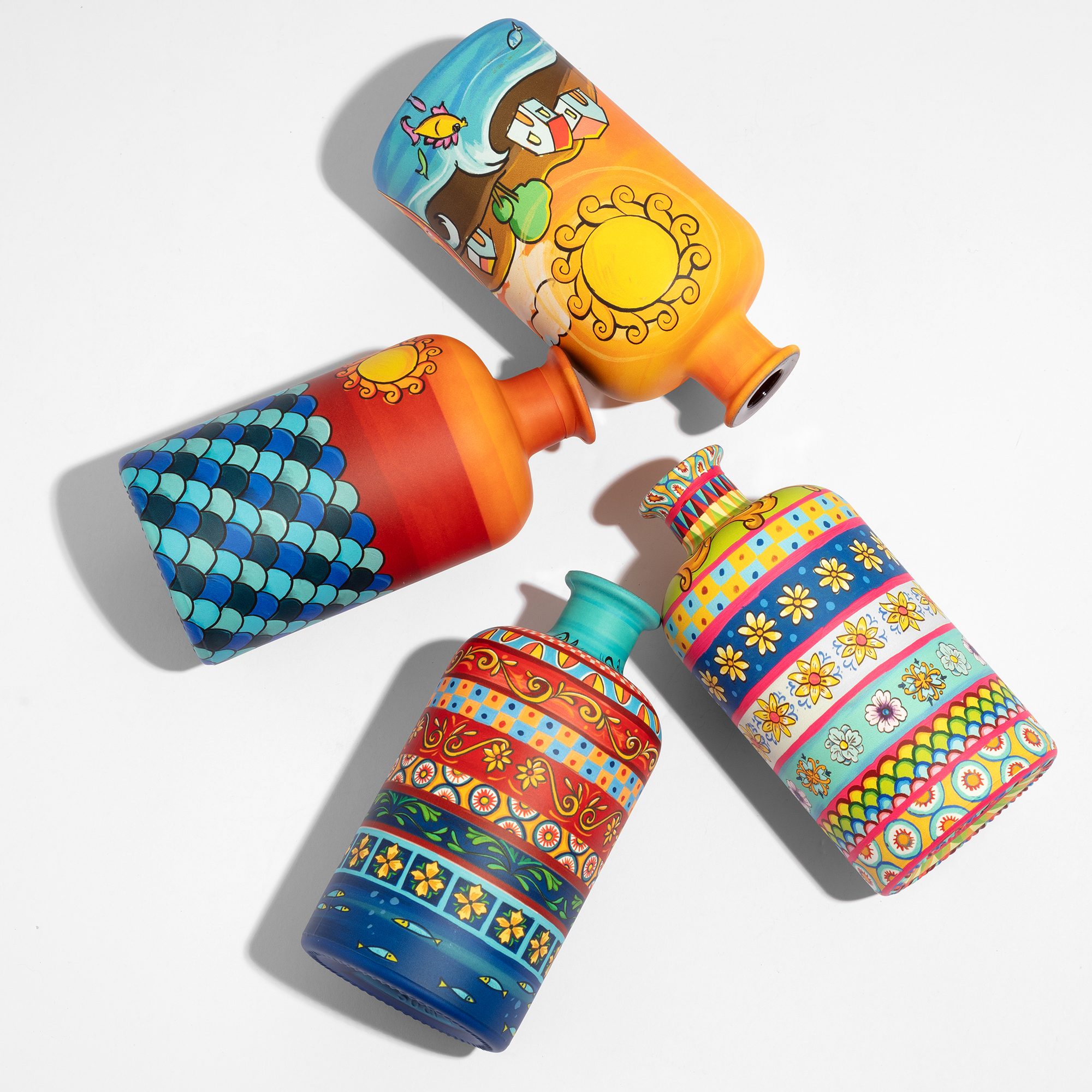
Digital sublimation on glass is direct-to-glass decoration: the artwork goes onto the bottle itself, not onto an intermediate layer, wrapping 360 degrees from neck to base with no plates, no screens, no colour separations and no minimum colour count. The design freedom that opens is the part most creative directors feel first, and it changes what a brief is allowed to ask for. The whole bottle becomes a canvas — no label boundaries, no panel seams — so a maximalist floral pattern or a continuous landscape does not stop at a rectangle but follows the silhouette all the way round. What the design file contains is what the glass delivers.
The fidelity is the second thing they feel. Sublimation prints at HD 1200 dpi, which carries photographic imagery, continuous-tone gradients, fine typography and generative visuals at a resolution comparable to offset print, applied directly to glass. Because there are no separations, colour is effectively unlimited: Pantone matches and full CMYK artworks print on the same run, and a gradient with ten thousand colours costs the same as a two-colour pattern. That economic flatness is what makes ambitious artwork viable rather than aspirational — the creative director is no longer designing against a colour budget.
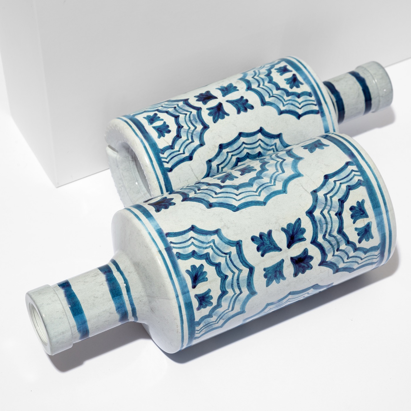
Geometry is where the technique earns its place in this category specifically. Tapered, curved, concave, asymmetric, decanter-shaped forms are exactly where premium spirits bottles tend to live — and exactly the geometry sublimation was built for. Sublimation works on those shapes without compromise, which means a brand can own a silhouette and still decorate it wall to wall. Two production plants in Verona run ATIU's sublimation process on waterborne inks, with output that holds from a 5,000-piece limited edition all the way up to several million pieces on a mass line, on the same platform, at up to 4,000 bottles an hour. A technical walk-through of how 360° sublimation works is available for teams who want the engineering detail.
The bottle is the only media that can't be skipped
Every other channel in a spirits marketing plan has a skip button. The object does not. A bottle behind a bar is seen by everyone in that room, all evening; it travels on Instagram without a media budget when someone photographs their negroni and the bottle is in frame; it sits on a back bar for months, still communicating the brand long after the campaign that launched it has been forgotten. The most ambitious spirits brands have understood something the industry is still catching up to: the bottle is not packaging, it is the most durable media placement in the plan, and unlike everything else it compounds. The brands that grasp this are not spending more on packaging — they are spending with more intention, on objects that keep working after the media plan goes dark.
This is also where pricing power lives. In a category where the distance between a premium and a super-premium position is measured in perception rather than production cost, the visual language of the bottle carries disproportionate weight. Shape, colour, surface quality, and the way decoration meets the curve of the glass without breaking are not finishing details — they are the argument for the price. Brands that have internalised this stop treating packaging as the last decision in a launch and start treating it as the first: the frame inside which the liquid, the story and the price all become legible. Decoration that reads as considered from across a room is what lets a brand hold its position when a competitor discounts.
Building that kind of authority requires a decoration system that holds the same colour language and the same precision across every surface, every unit and every production run. An icon does not need a label to be recognised — the silhouette carries the brand and the geometry signals the price tier before a word is read. Sublimation answers this structurally, because the decoration bonds directly into the glass at HD 1200 dpi across the full 360° of the bottle, so what the creative director approved becomes what lands on the back bar, precisely, every time. That repeatability across batches is what turns a one-off good-looking bottle into a recognisable, defensible brand asset.
Fashion on glass, and the sustainability cut
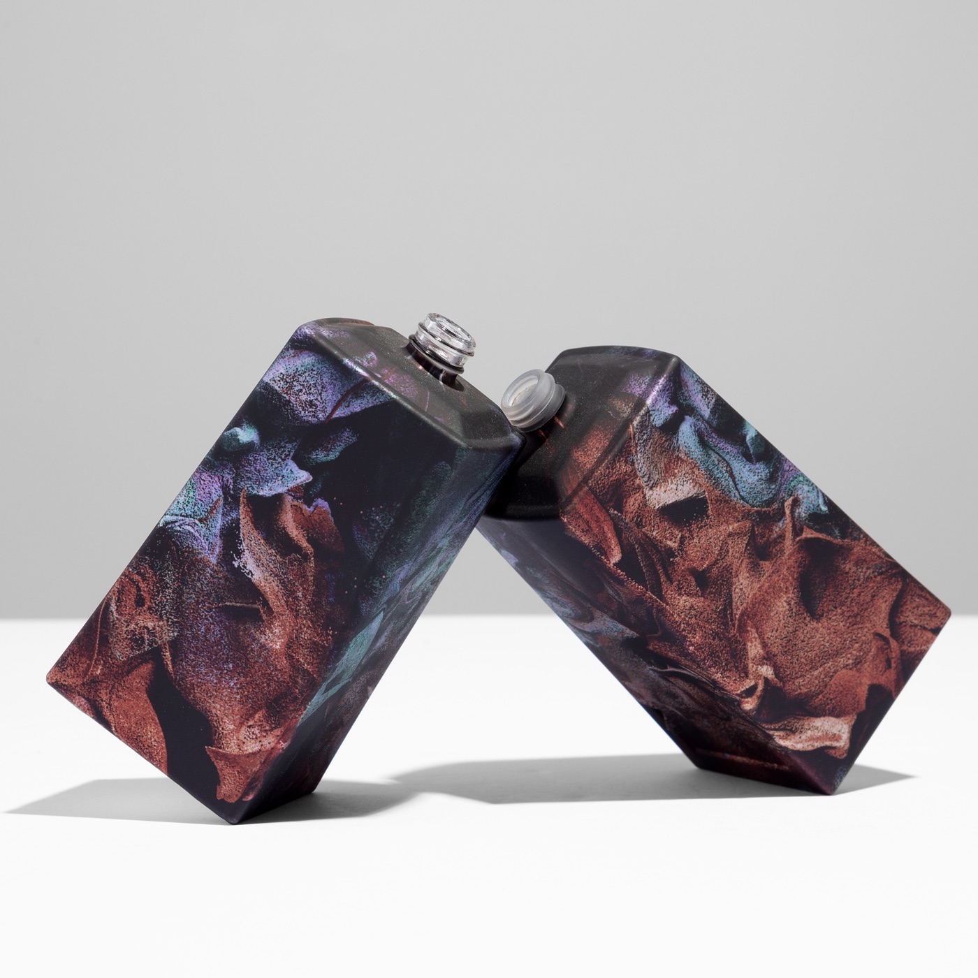
A fashion-house edition on a super-premium Scotch is the clearest example of what the technique opens up. The artwork was the kind of maximalist floral pattern that belongs on a runway, not on a rectangular label, and the brand team asked for the full bottle — neck to base, no cropping, no panel compromise. Sublimation delivered it: the print wraps the flacon without a visible seam, wall to wall, with colour fidelity that holds against the original artwork, producing a bottle that reads on the shelf as a fashion object in its own right. The commercial effect is the part worth naming — blended Scotch buyers who held the first samples described them in the language of luxury goods reviews rather than spirits packaging. The bottle entered the conversation on its own terms.
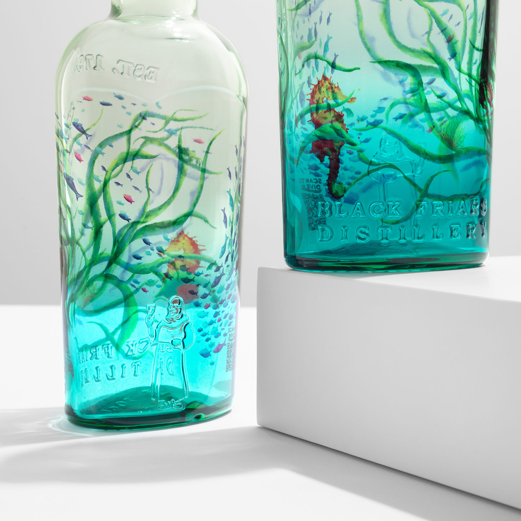
Plymouth Gin, decorated in collaboration with the Ocean Conservation Trust, is the other edge of the same argument: a different brief answered by the same technique. Plymouth's team wanted a bottle that could carry a sustainability message without diluting it, rather than the usual soft compromise of recycled glass, a natural-toned label and a series of asterisks. Here the decoration itself is the credential. Sublimation kept the glass fully recyclable because the decoration adds no plastic and no separate material to be stripped — it is a minimal surface layer applied with waterborne inks, no solvents and no heavy metals, cured below 180°C — so the decorated bottle enters the glass recycling stream without separation or pre-treatment. The Ocean Conservation Trust artwork wraps the Plymouth silhouette at HD fidelity, and the claim holds up to a retailer's procurement audit with no asterisk attached.
These two references bracket the range of what a premium spirits brand is usually trying to do: maximise perceived value on one bottle, and pass a hardening sustainability gate on another, often within the same portfolio. The point is not that one project was more demanding than the other — it is that a single decoration platform answered both without changing the underlying process. That is what lets a brand build a coherent visual system across a core range and its collaborations, rather than sourcing each project from a different technique with a different look and a different set of trade-offs.
Two 2026 trends the bottle now has to carry
Two structural shifts are accelerating at once in 2026, and both push the same way: the bottle has to work harder. The first is that no-alcohol and low-alcohol spirits are no longer a niche but a category growing at double digits, and they sit physically on the same shelf as the full-strength originals. A no-alcohol version of a premium gin or single malt is not a smaller product or a line extension — it is a positioning decision. It asks consumers to trust that it deserves the same ritual, the same glass and, often, the same price point, and for that trust to hold the bottle must carry exactly the same visual authority as the flagship. A bottle that looks like a reformulation signals lesser product; a bottle that asserts itself signals new category, same authority. The brands succeeding here give no-alcohol launches the same decoration ambition — HD at 1200 dpi, colour that holds shoulder to base, geometry that reads premium at arm's length and on a phone camera.
The second shift is that AI is moving from marketing jargon into the brief cycle itself. Premium spirits brands are running AI-assisted concept generation, faster visual testing and data-driven limited-edition drops triggered by purchase signals. None of this replaces the creative director; what it does is compress the calendar. When a brand's system identifies a consumer preference cluster and recommends a drop, the creative and decoration brief now follows within weeks rather than quarters, and the number of concepts in play multiplies. For a decoration partner, that creates one clear pressure — the brands that can move from approved brief to physical sample in a compressed window become the natural partners, and the ones that cannot become the bottleneck.
Both trends land in the same place: decoration is where strategy becomes object. A run of 50,000 bottles with genuine HD decoration — sample in five working days, produced in a single shift — says something categorically different from a limited edition that is a sticker variant on the standard bottle, and consumers and creative directors both know the difference. Because sublimation carries generative and photographic artwork at full resolution and needs no plates to change a design, it is built for a world where the concept can arrive later and change faster. The answer to an ambitious 2026 brief is not to adapt the idea to the process; it is to bring the idea and let the process carry it.
Limited editions and seasonal programs, without the plate cost
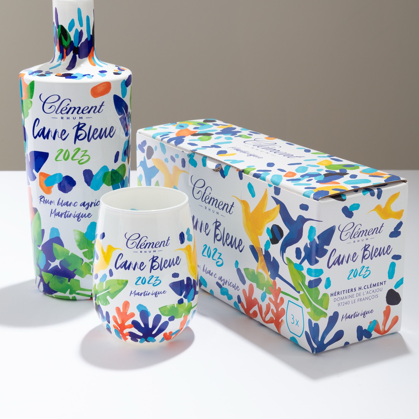
Because sublimation is plate-free, a limited edition stops being an expensive exception and becomes a repeatable program. There is no setup investment to recover over a minimum run, so a brand can run a rolling calendar of editions instead of one hero drop a year. Seasonal releases — holiday, summer, harvest — create annual buying occasions with unique artwork each time and no tooling to amortise. Artist and fashion collaborations wrap the bottle at HD quality to create genuinely collectible pieces, and regional editions can be tailored precisely to a market, from a Lunar New Year design for Asia to a Diwali edition for India, with the artwork simply swapped in the file rather than re-tooled.
The same economics unlock a long list of program ideas that used to be hard to justify. Single-cask and vintage designations can each carry their own visual identity; anniversary editions can lean on heritage typography, archival imagery and gold tones to reinforce legacy; travel-retail exclusives add perceived value in the duty-free channel where a bottle has roughly four seconds to earn a traveller's attention. Bartender editions and charity partnerships turn the object into a status symbol or a purpose statement, and festival or event tie-ins create urgency and social-media momentum around a cultural moment. None of these require a new plate, which is precisely why a brand can run several in a year rather than choosing one.
Sublimation also supports variable-data printing, so individual bottles can carry unique names, serial numbers or messages — ideal for numbered collector editions, corporate gifting and personalised gift moments. The strategic value of a limited edition is that it does three things at once: it creates a desirability peak that reinforces the core range rather than diluting it, it earns attention in the trade and among collectors without paid media, and it gives the brand a reason to return to the conversation with something genuinely worth looking at. The execution gap is where most value is lost — an edition that takes eighteen months to produce arrives after the moment has passed, and a collector series that drifts in colour between batches loses the coherence that made it a series. Speed and colour repeatability are therefore not production niceties but strategic requirements, and a plate-free platform is what makes the whole program executable rather than aspirational.
What the old techniques still do well
Sublimation is not the answer to every spirits brief, and an honest guide has to name where the legacy techniques still lead. Screen printing remains strong on simple flat-panel work on cylindrical bottles at very high volume with a minimal colour count — when the design is two Pantones on a glass hi-ball and the run is enormous, a screen house is a sensible partner. Hot stamping and foils are the right call for specific metallic accents, such as a logo on a cap or a ring at the shoulder, where that particular finish is the whole point. Sleeve labelling suits products that must wrap a full surface where the brand accepts a plastic layer over the container, which is common in food and beverage lines carrying dense regulatory information.
The right question in a premium spirits brief is therefore not which technique wins in the abstract, but what this specific brief is asking for and which technique leads on that. When the answer involves complex geometries, ambitious continuous-tone or collaborator artwork, a hardening sustainability gate, and a short launch window, sublimation leads more often than it used to — and it now leads on briefs that would have gone to screen and paper a decade ago. That is the shift worth naming, and it is why the brands making the most interesting decisions in the category are the ones matching the technique to the intention rather than defaulting to what they have always used.
What a premium spirits brief looks like, technically
A brief that lands well on a sublimation platform usually has some version of five lines on its first page. Bottle geometry comes first — tapered, square, decanter or asymmetric — because the more unusual the form, the stronger the case for a technique that works without screens. Artwork complexity is second: continuous-tone imagery, gradients, fine typography, generative visuals or collaborator artwork all point to sublimation, because carrying that detail at full resolution across the whole form is exactly what the process is built to do. Together these two lines decide most briefs before volume is even discussed.
The remaining lines are volume, sustainability and timeline. On volume, the same platform runs a 5,000-piece limited edition and a mass line into the millions of pieces per year, at up to 4,000 bottles an hour and up to three SKUs on the same primer base in a single run, with no setup costs to recover. On sustainability, the specification usually names PPWR exposure, an EPR scheme, retailer procurement criteria or a recyclability target — and sublimation answers all of them, because the decoration adds no plastic, uses waterborne inks with no solvents and no heavy metals, cures below 180°C, and leaves the glass fully recyclable as a minimal surface layer. On timeline, ATIU produces a sample in five working days from component arrival, and because samples run on production equipment the prototype is the production bottle — there is no translation between studio and shelf. A year ago, geometry, artwork, sustainability and speed were often four separate conversations with four different suppliers; on a sublimation platform they become one.
Related reading: test your next limited edition before producing it. Or request a mock-up.