Preparing Print-Ready Files for Sublimation
Great decoration starts with great artwork files. In sublimation there is no engraving, no screen and no plate: the file a designer supplies is the master from which the decoration is produced, so its quality carries directly onto the glass. That makes file preparation less a formality and more the first act of the decoration itself. The general prepress rules — CMYK, adequate resolution, clean bleed — still apply, but decorating a bottle adds a dimension that flat print does not have: the artwork must live on a three-dimensional form, wrap a full 360 degrees and meet itself somewhere on the circumference. This guide covers both layers, starting with the universal requirements and moving into the geometry that is specific to glass. For a broader view of how the process itself works, see what sublimation on packaging actually is.
File Format
ATIU accepts high-resolution PDF, TIFF and AI files. Vector artwork is preferred for text, logos and geometric elements, because vectors scale cleanly to any bottle size and render at the full resolution of the output pipeline rather than the resolution at which they were saved. Photographic and textural elements should be embedded at their native resolution, never resampled upward to hit a number. Layered files are genuinely useful rather than merely welcome: when a prepress adjustment is needed — nudging a logo away from a seam, rebalancing a background tone against a coloured glass — a layered file lets ATIU's team make the change surgically instead of asking for a full re-export. Flattened files are accepted, but they move every adjustment back to the designer's desk and add a round trip to the schedule.
Resolution: 300 dpi In, up to 1200 dpi Out
The working rule is a minimum of 300 dpi at final print size for photographic imagery, and it is worth understanding why that number is a floor rather than a ceiling. ATIU's sublimation pipeline renders artwork at up to 1200 dpi on the glass, which means the output device can address far finer detail than a 300 dpi photograph contains. That headroom is not wasted: it is what keeps vector edges crisp, serif type legible at flacon scale, and tonal gradients smooth and continuous rather than visibly stepped — the kinds of detail that a curved, light-catching glass surface puts under a magnifying lens. So the practical guidance is layered. Supply photographs at 300 dpi or better at final size; if a native 600 dpi scan or a large-format original exists, send it, because genuine extra detail survives all the way to the bottle. What never helps is upscaling: interpolation invents pixels rather than information, and the softness or artefacts it introduces — invisible on a backlit screen — become visible on glass at 1200 dpi output. Vectors, by contrast, are resolution-independent and always print at the pipeline's full capability, which is one more reason to keep type and linework vector for as long as possible.
Colour Profiles
Artwork should be supplied in CMYK colour space, and Pantone references should be included for every brand-critical colour — not as an alternative colour mode, but as the target the printed result is measured against. ATIU's printing team in Verona manages colour conversion and profiling for each glass substrate, and this matters more than it would on paper: the same CMYK build reads differently on flint, frosted or coloured glass, because the substrate participates in the final colour. Profiling per substrate is how a brand red stays the same red across a clear vodka bottle and a dark green wine bottle. A physical colour proof or an existing reference sample — a previously approved bottle, a drawdown, even a competitor pack that shows the intended depth — accelerates approval considerably, because it replaces a conversation about numbers with a conversation about an object. Where no physical reference exists, the Pantone target plus the substrate specification is enough for the team to build a first proof.
How Artwork Behaves on a Three-Dimensional Form
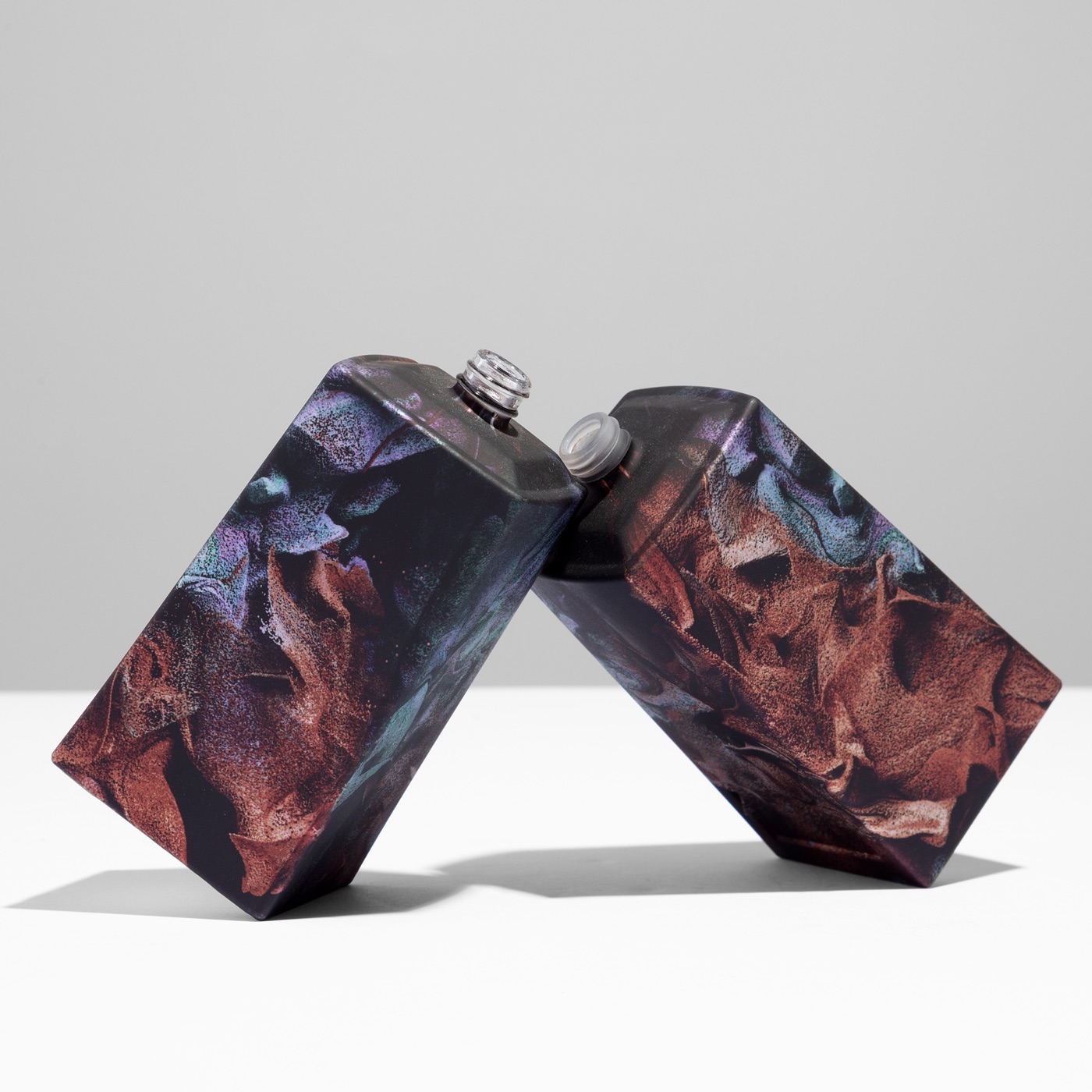
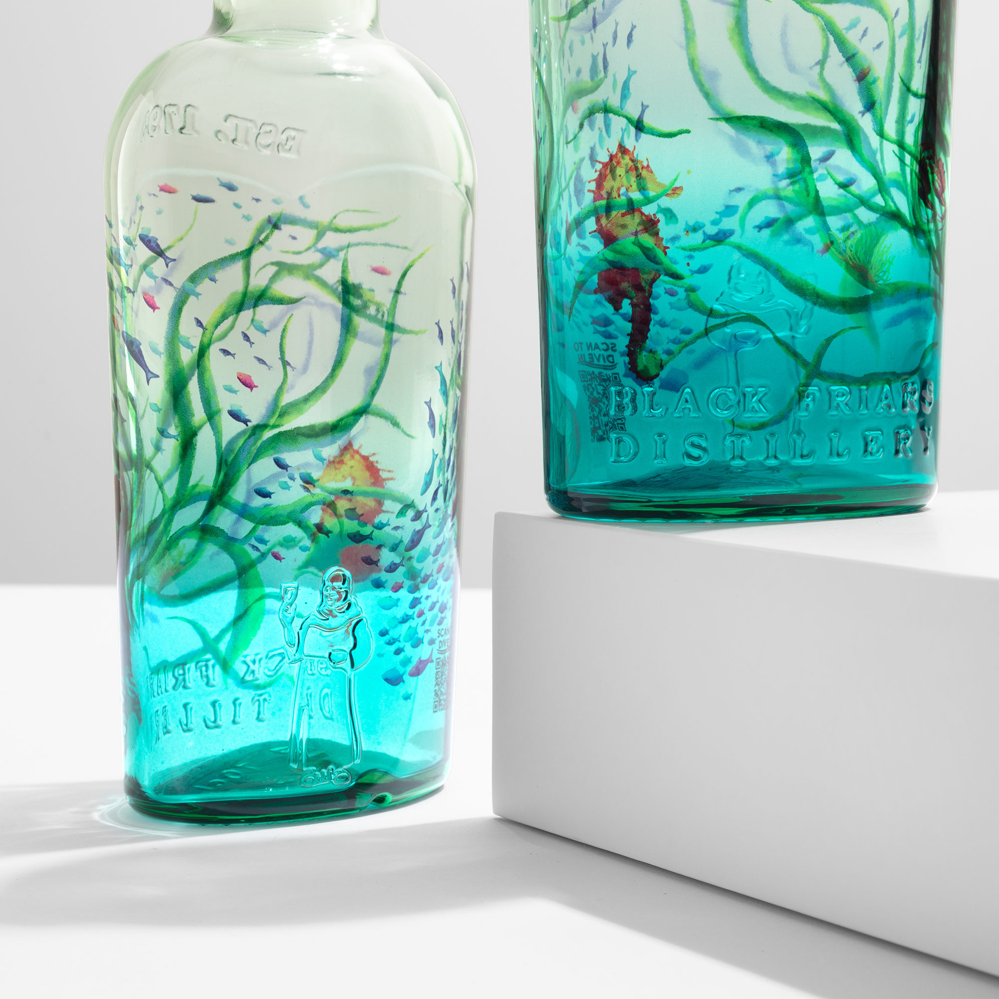
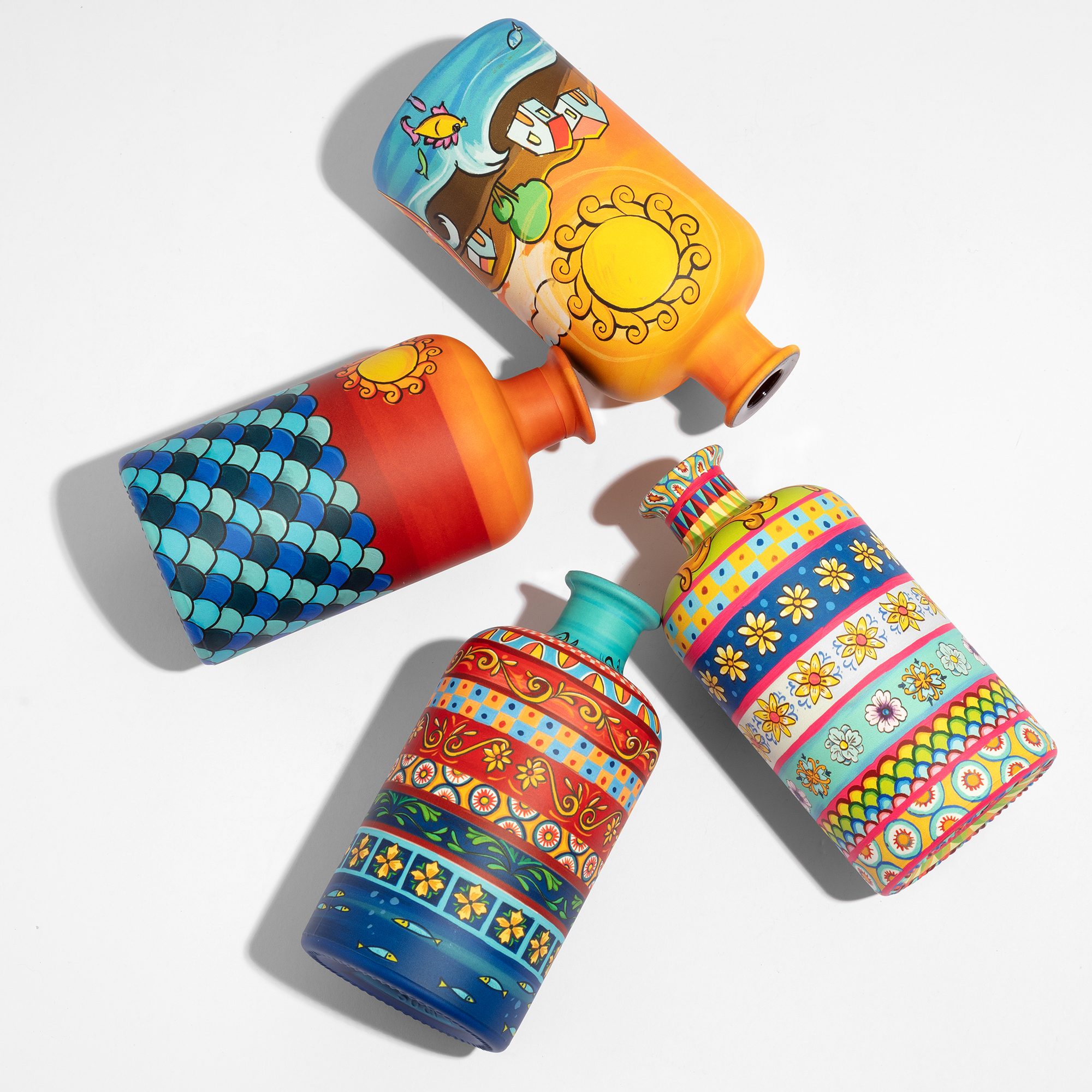
This is the part of file preparation that no flat-print checklist covers. A bottle is not a cylinder wearing a label: it tapers, shoulders, sometimes carries concave panels or facets, and each of those transitions changes how artwork reads. On the straight cylindrical body, a horizontal band stays horizontal and a repeating motif keeps its spacing. On a tapered shoulder, the circumference shrinks as the glass rises, so a pattern that was evenly spaced at the body converges as it climbs — vertical stripes lean toward each other, a grid compresses, a face or logotype placed there narrows visibly. On a concave face, the surface curves away from the viewer and artwork foreshortens at the edges of the panel. None of this is a defect; it is geometry, and it can be designed for. This is why ATIU builds each artwork template from the exact geometry of the specific bottle — the flattened working surface in the file corresponds point-for-point with the real glass, so what the designer places at a given coordinate lands at that coordinate on the form. When requesting a template, include the glassmaker's catalogue reference in the brief — a Saverglass, Verescence or Bormioli Luigi item number identifies the exact mould, and with it the exact surface the template must describe. The practical design habits that follow: keep logos, type and anything geometric on the straightest portion of the body; let organic, textural or gradient artwork carry the shoulder and heel, where convergence reads as intention rather than error; and preview critical elements on the template's marked zones before falling in love with a layout. The results this thinking unlocks are visible in full-body sublimation decoration, where artwork runs continuously from base to neck.
The 360° Wrap and the Seam
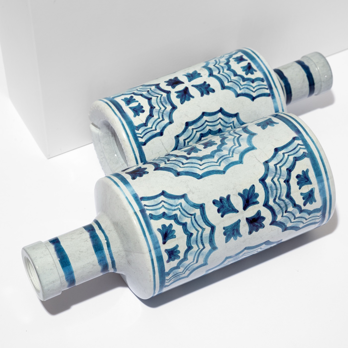
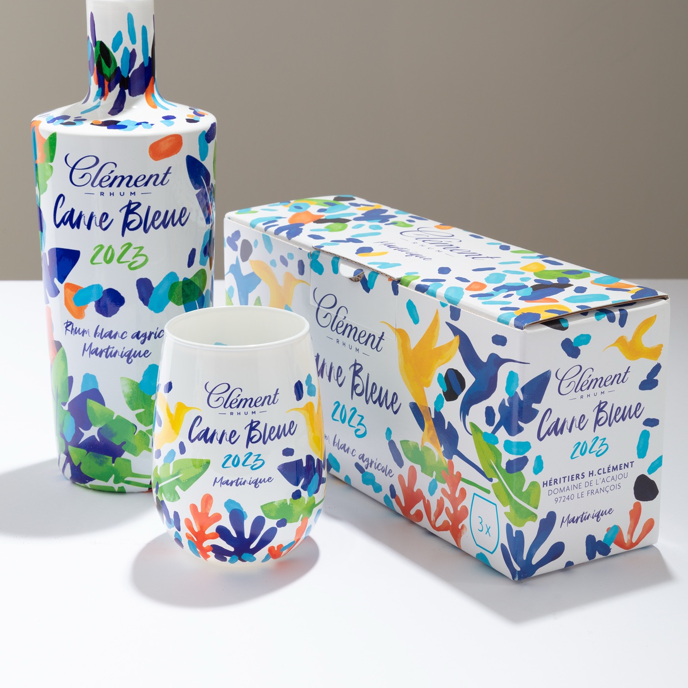
Sublimation decorates the full circumference of the bottle, base to neck, which means the artwork's left and right edges physically meet on the glass. Where they meet is a decision, not an accident: ATIU places the join on the least prominent axis of the bottle — typically the back, opposite the principal display face — so the front presentation is uninterrupted. For artwork with a defined front and back, this is straightforward; the template marks the seam position and the designer simply keeps critical elements away from it. Continuous patterns demand more discipline. A motif that wraps the whole bottle — a repeating texture, an all-over botanical, a gradient that circles the glass — must be built so that its left edge and right edge match exactly, the way a tileable repeat matches in textile or wallpaper design. If the edges are matched, the wrap reads as a single unbroken surface and the eye never finds the join; if they are not, the mismatch line becomes the one thing the eye finds first. Building the repeat to the template's exact circumference, rather than to a round number, is what makes the match possible, and it is one of the checks ATIU's prepress review performs on every wrapped pattern.
Bleed and Safe Zones
Include a minimum 3mm bleed beyond the decoration area, exactly as in conventional prepress, so that registration tolerance never produces an unprinted sliver at the edge of the decorated zone. The safe zone deserves equal respect: critical text and logos should sit comfortably inside it, away from the seam line and away from the transitions where the form begins to curve. ATIU's templates mark all of these boundaries explicitly — decoration limits, bleed, safe margins and seam position — so the file can be checked against them rather than against guesswork. A useful habit is to switch the template's guide layer on as the last step before export and walk the artwork edge to edge; thirty seconds of checking at this stage replaces a revision cycle later.
Prepress Review and Sampling
ATIU's team reviews every file before production: resolution, colour builds against the Pantone targets, bleed, seam matching on wrapped patterns and registration on the template. If adjustments are needed, the team collaborates directly with the designers to optimise the file, at no additional charge — the goal is that the decoration produced matches the concept that was approved, not merely the file that was sent. Once the artwork is confirmed, a production-line sample follows in five working days, decorated on the actual bottle rather than simulated on screen, so the first thing a brand evaluates is the real object in real light. That sample is where the file-preparation work pays off: colour measured against the physical target, the pattern wrapping without a visible join, and the artwork sitting on the form exactly as the template promised.
Learn more about how sublimation works or get in touch.