Gradient and Vignette Coating on Glass Bottles.
The short answer: a vignette is colour that fades across a glass bottle: full colour at the base, clear glass at the shoulder, or one tone melting into the next. At ATIU the fade is part of the artwork. It is printed in one pass with the pattern and the type, 360° around the bottle at up to 1200 dpi, and fused into a waterborne primer, from 5,000 pieces to millions.
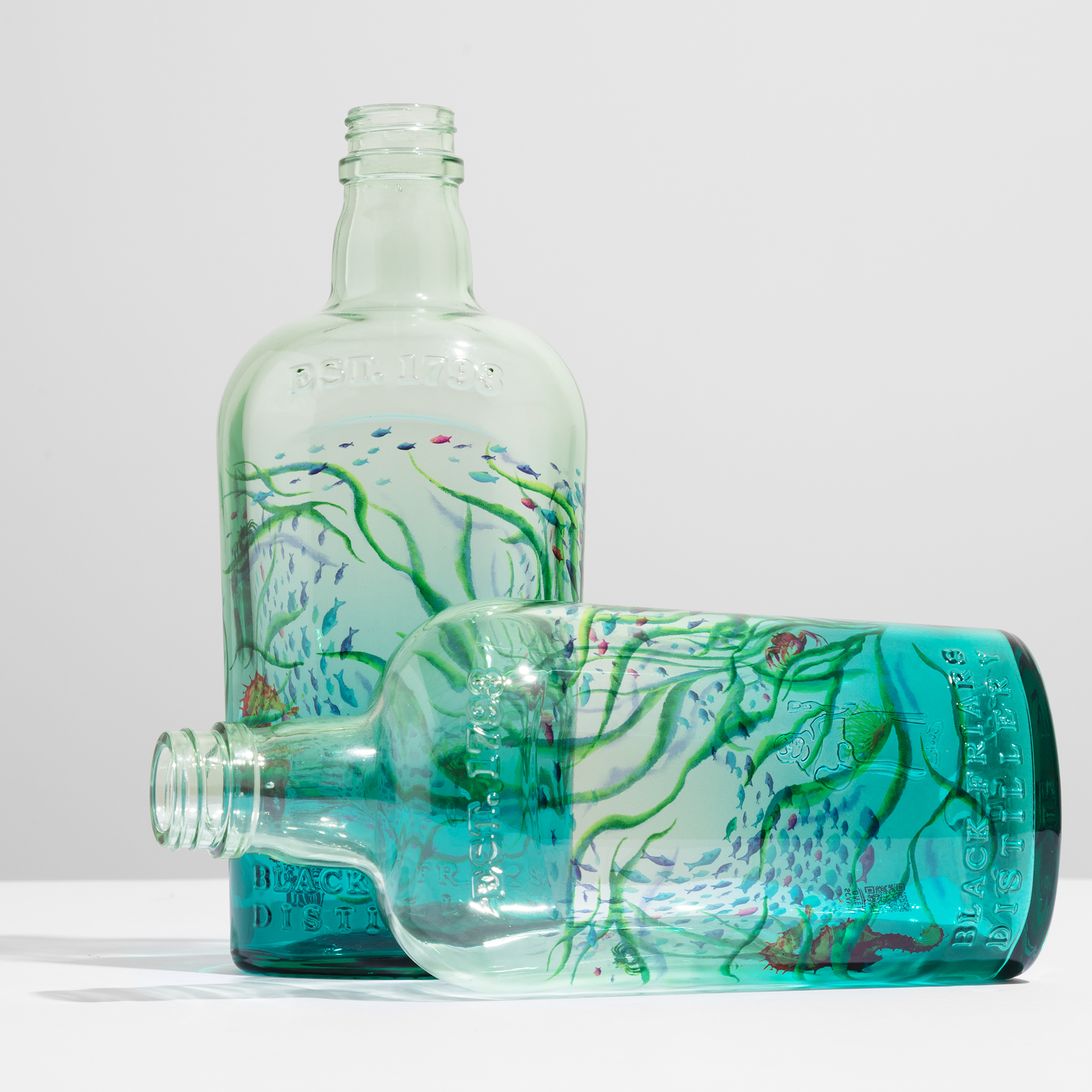
Hold a gin up to the light. The liquid has no colour of its own. Now give the glass a blue that is deep at the base and gone by the shoulder. The gin turns into sea.
That is what a vignette does. It lends the liquid a colour, then lets go of it before the colour becomes a wall.
Most of the industry treats a fade as a finishing question: how far up the bottle the colour should climb. We treat it as a design question. Not where the colour stops. Where it goes.
Any colour. Any direction.
The classic fade, the one coating made familiar, runs in one colour from the base upward. Sublimation is not bound by it. The fade is drawn in the artwork, so it can run bottom to top, top to bottom, side to side, on the diagonal, or follow the line of the shoulder. It can move through five colours instead of one. It can start again on the other face of the bottle. Two fades can cross.
And it arrives with everything else: the illustration, the fine type, the barcode, every colour the designer used, printed together in a single pass, 360° from base to neck, and fused into the primer. Nothing is adjusted afterwards. Nothing is aligned by eye. The thousandth bottle carries the fade exactly where the first one did.
Three colourways of one edition? Three files, printed back to back in the same run.
The primer sets the mood
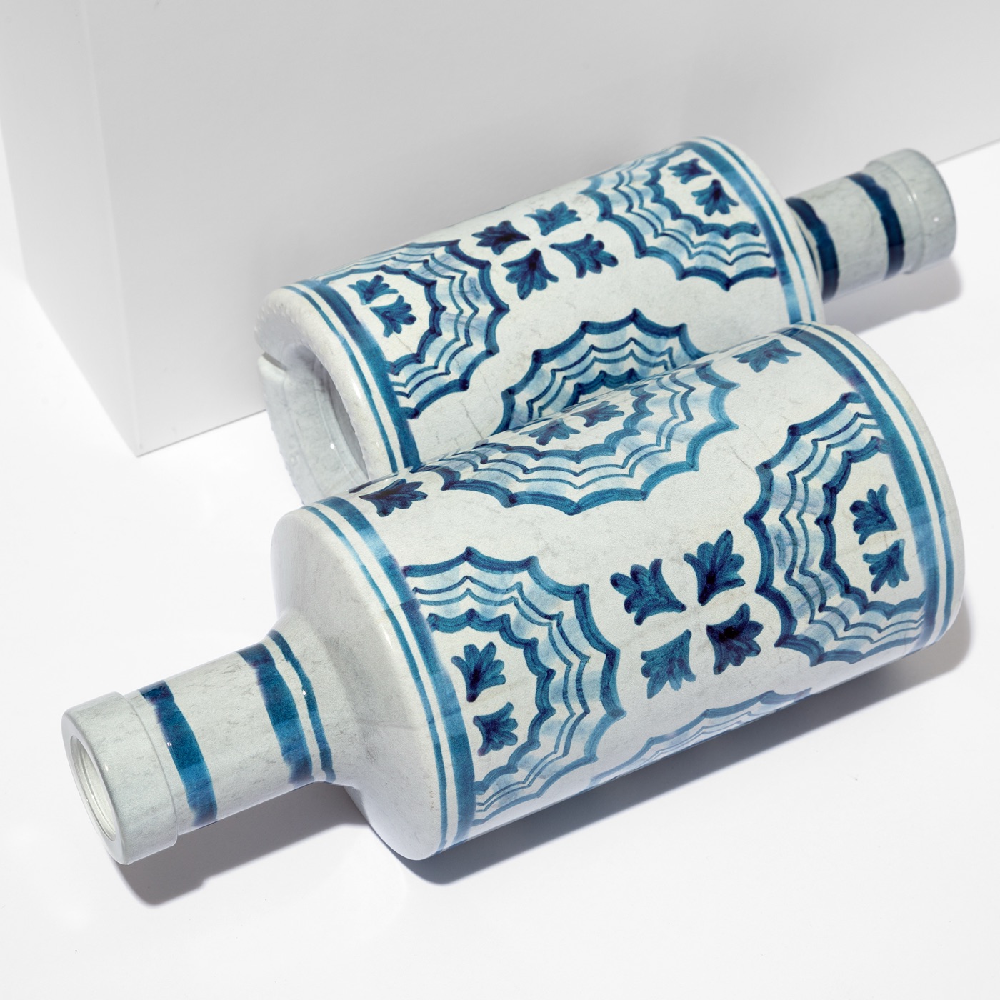
Under every artwork there is a primer, and the primer decides what kind of fade you get. White: opaque and ceramic-like, the colour sitting on a porcelain ground. Clear: transparent, glass and liquid showing through, the colour floating on them. Milky: a veil. Metallic: full, or laid as a dégradé of its own with the artwork on top. Frost: cold and matte under the fingers.
This base layer is what the industry calls coating. We apply it on the same line as the decoration, one pass, one approval, and a bottle can stop there when all it needs is a colour; our coating guide covers that case. The primer families are the same for every project, which is why the Swatch Kit exists: you can hold the base of your fade in your hand before the first sample is made.
Three bottles, three fades
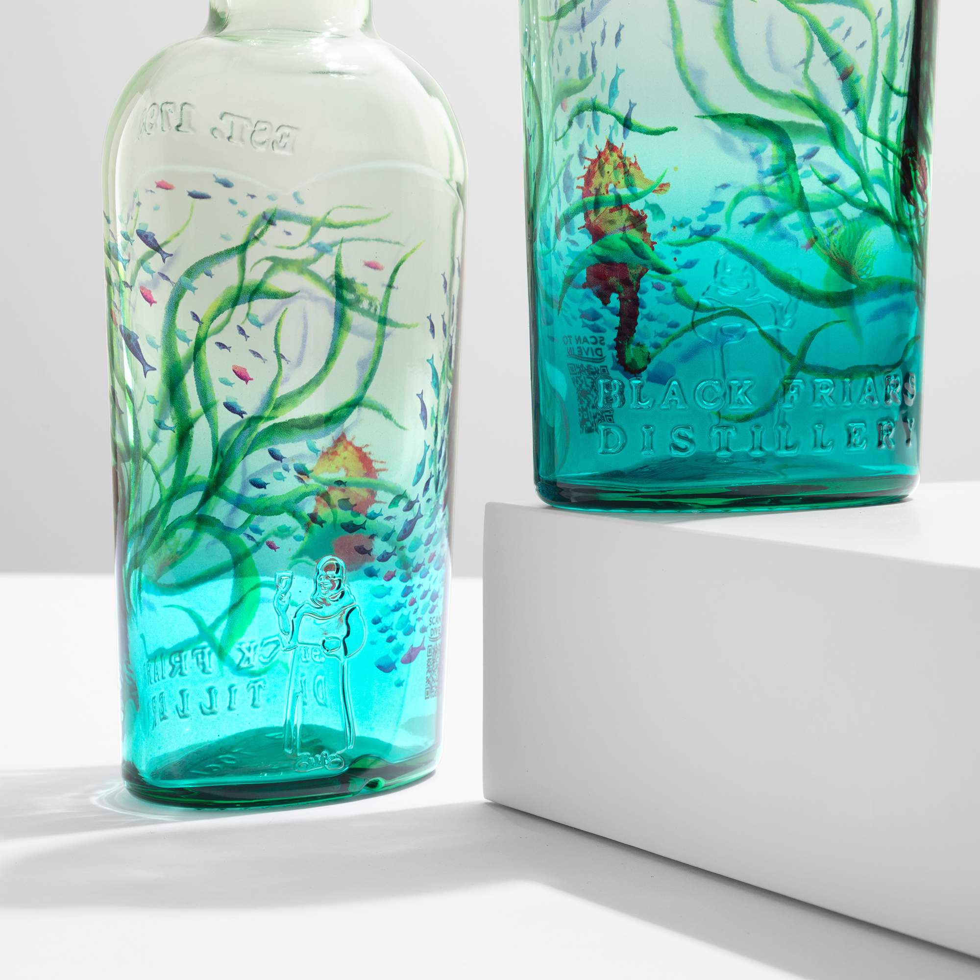
Plymouth Gin, Ocean Edition. Year 2: a blue-tinted bottle, a clear primer, and seagrass, fish and seahorses set into the colour of the water itself. Year 3 went fully under: the scene wraps the whole bottle and runs straight over the distillery's embossing, as if the relief were part of the reef.
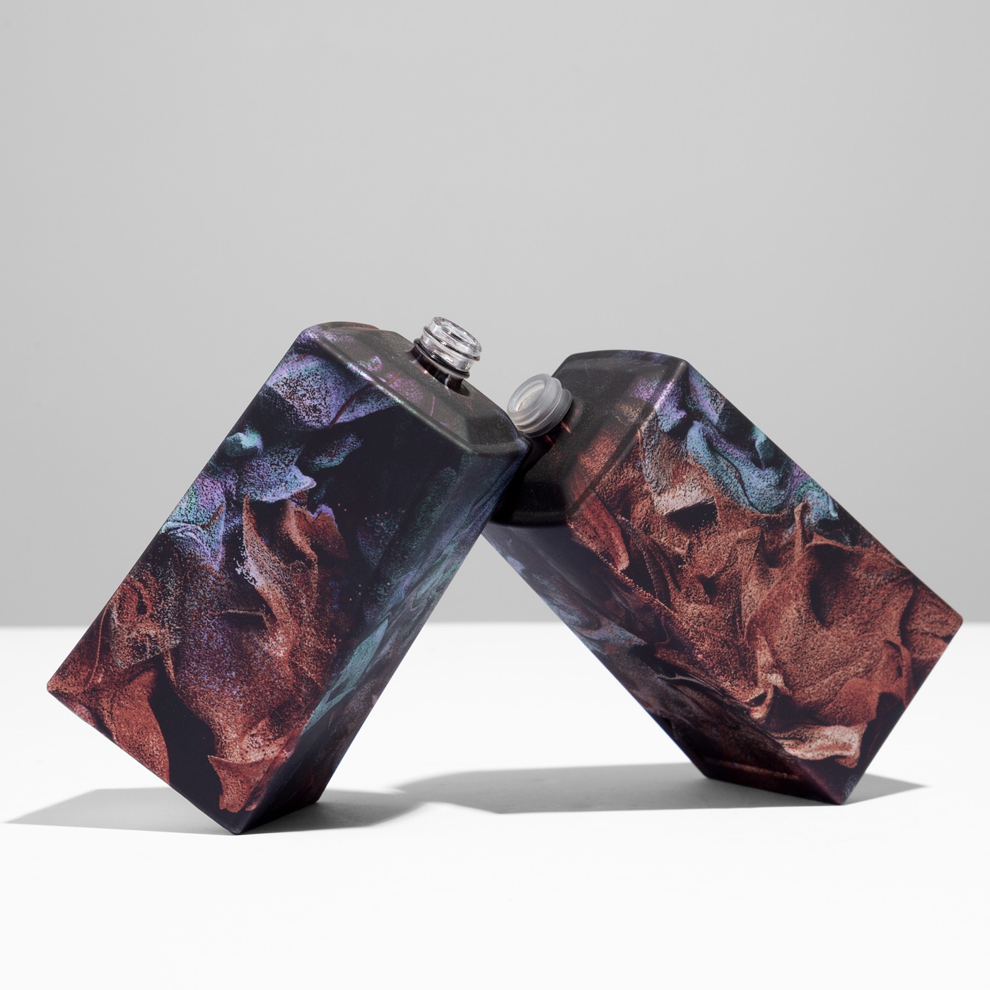
Bvlgari Le Gemme Tygar. Refik Anadol's artwork is made of nothing but gradients, hundreds of tones in motion with no edge anywhere. Every transition reached the flacon as he composed it, on a metallic soft-touch matte primer, with a zamac cap matched to the glass so the two read as one.
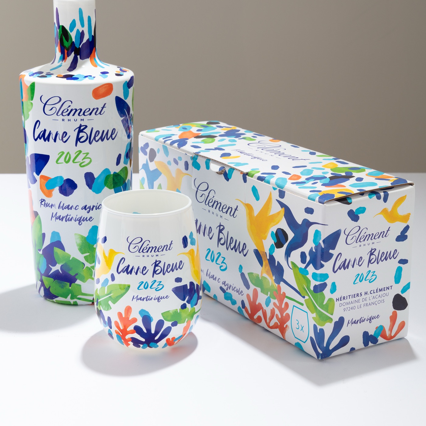
Rhum Clément, Canne Bleue 2023. Brushstrokes, gradients, fine text and the barcode in one continuous surface. Nothing added on top, because nothing needed to be.
Can a gradient be Pantone-matched on glass?
Less than people hope, and more than they fear. A Pantone swatch is flat, opaque and printed on paper. A bottle is curved, sometimes tinted, with a liquid behind it and a primer under the colour. So the match is not read off a chart. It is agreed on the bottle.
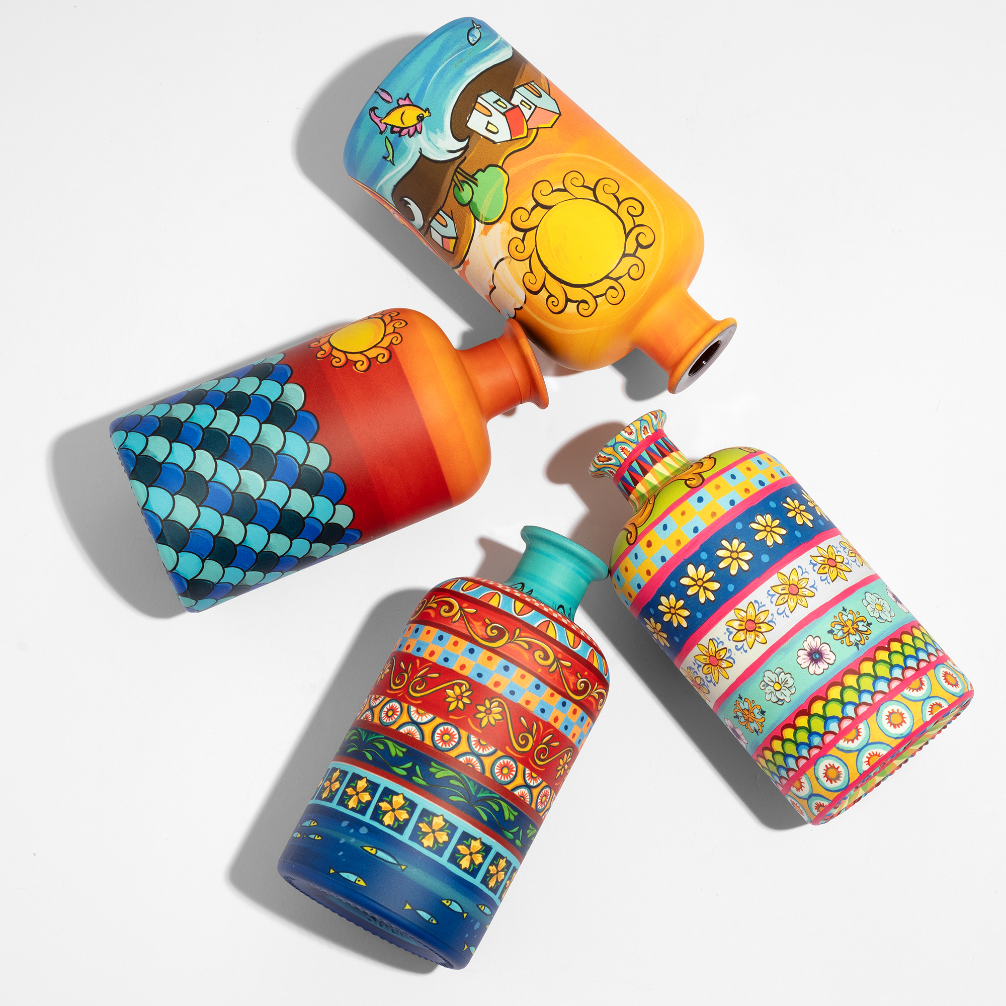
Your reference, Pantone or Cromalin, goes into calibrated CMYK. A production-line sample arrives in five working days, from the line that will run the job. You approve the bottle, and that bottle becomes the standard, held to light and dark limits you sign or to a ΔE you agree. For a fade we approve three points: the full colour, the mid-tone, and the moment the glass takes over. Centonze Ice Blue went through the same step, with its blue approved against the original Sicilian majolica rather than a swatch, before a first run of around ten thousand bottles.
What does a gradient cost, and how long does it take?
No more than a flat artwork, and about a month. Price moves with three things: whether the bottle needs a protective top coating (perfumery yes, spirits usually no), the size of the bottle, and the quantity, on a list that runs from 5,000 to 1,000,000 pieces. The complexity of the design barely registers. A fade with a hundred colours and a fade with two cost about the same.
The sample takes five working days. Production typically follows a month after the order, retro-planned from your launch date, on two plants in Verona that run up to 4,000 bottles an hour and 30 million pieces a year per plant. Brief us with the bottle and its glassmaker reference, the artwork as a print-ready file with the fade built in, and the quantities per colourway. If your filling line is demanding, ask for a pallet trial before the run.
What stays on the glass
A waterborne primer and waterborne inks, cured at low temperature, with heavy metals below the PPWR limit, third-party tested. No plastic, no adhesive, no second component. The glass stays glass and goes back into standard glass recycling. We have measured our carbon footprint on Scope 1, 2 and 3 since 2023 with Up2You, and the figures are there for your own reporting.
A fade is a small decision with a long shelf life. Put it in the file. Approve it on the bottle. Then watch the thousandth piece come off the line looking exactly like the first.
Get in touch with the bottle and the idea, or start with the Swatch Kit.