What Is Sublimation on Glass?
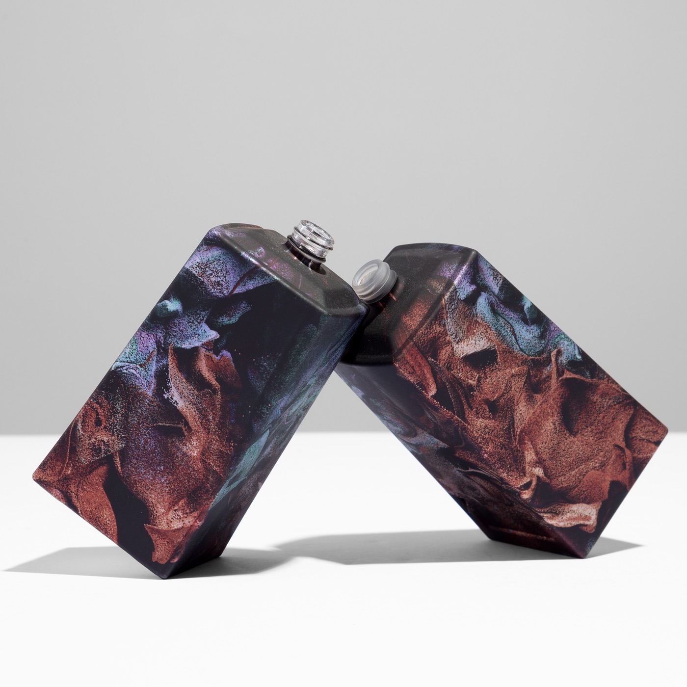
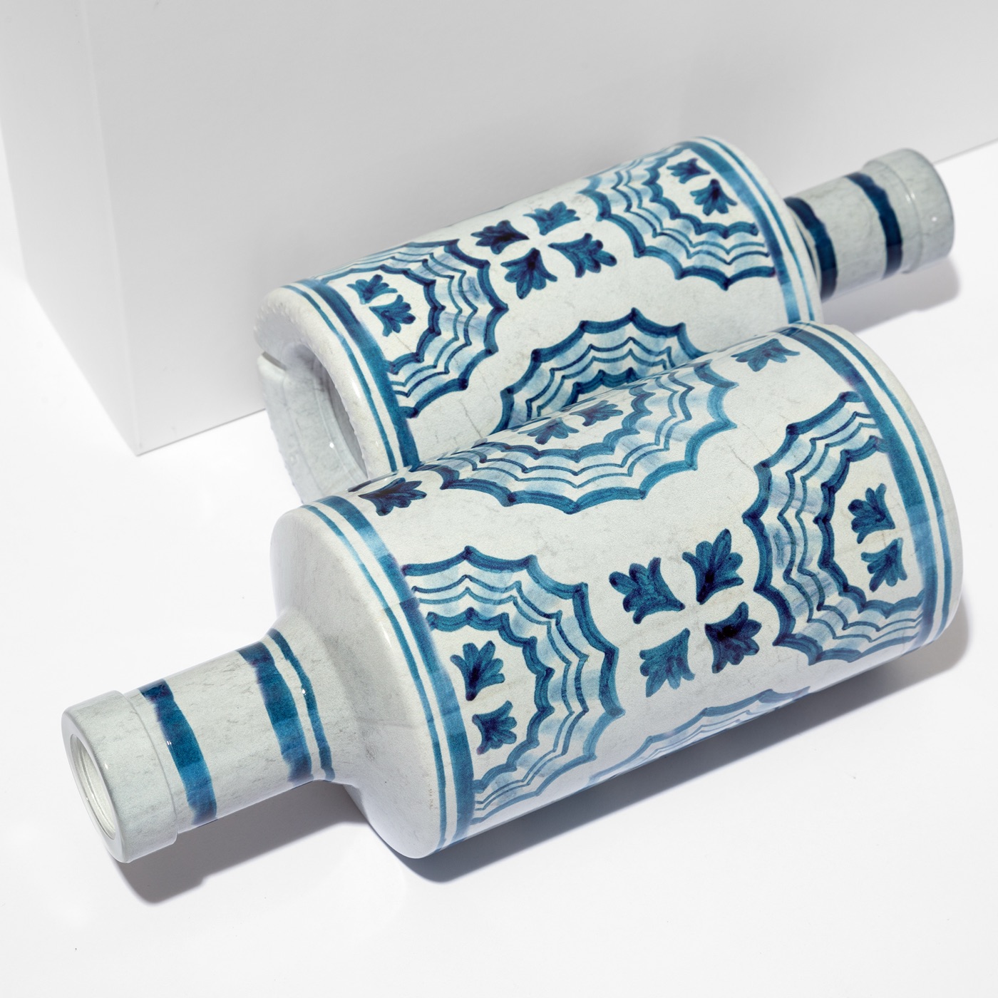
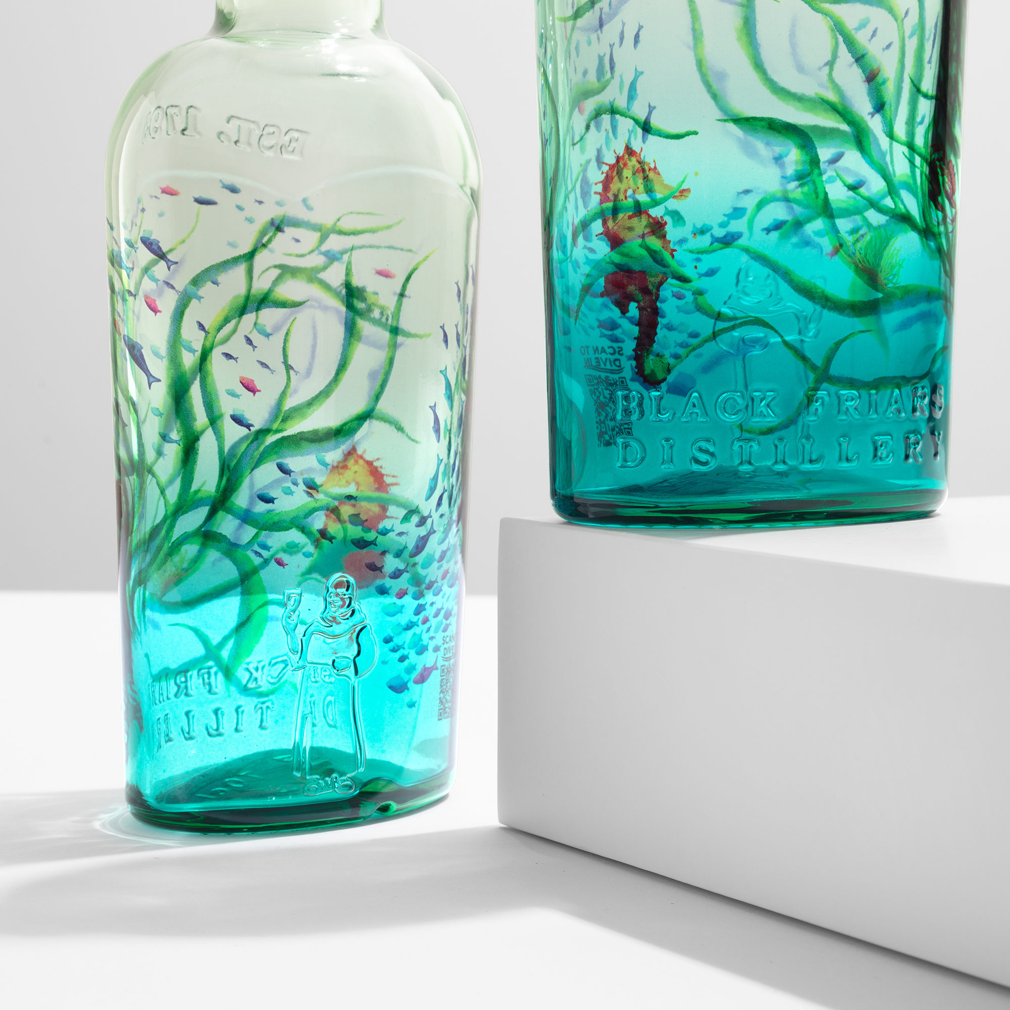
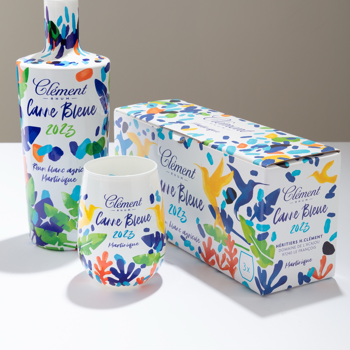
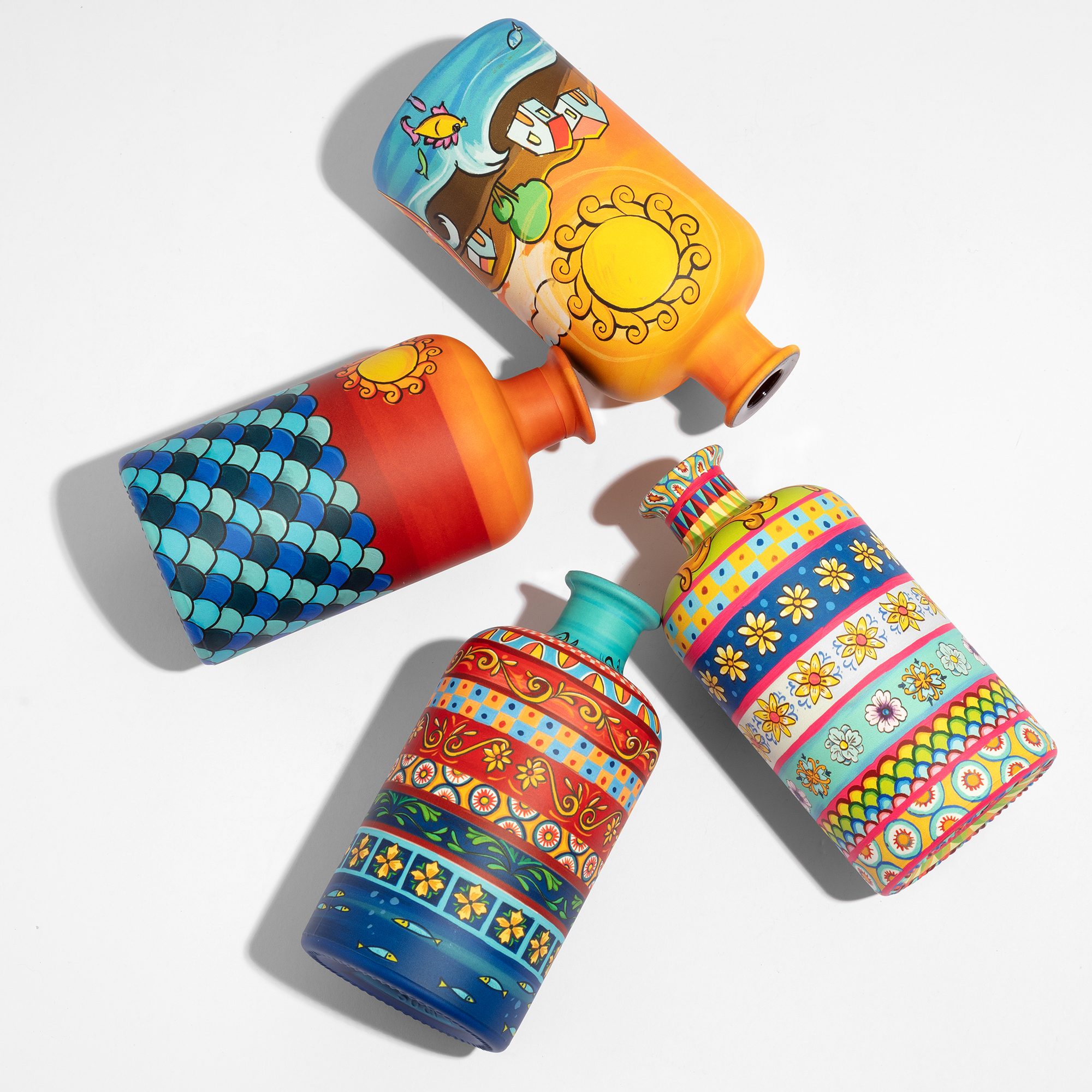
Sublimation is a glass decoration process in which a full-colour artwork is printed in CMYK, turned into gas by heat and pressure, and fused into a waterborne primer applied to the bottle. The image does not sit on the surface as a label or a layer: it becomes part of the coating. It covers the whole bottle, base to neck, at 1200 dpi, with no seam and no colour limit. ATIU runs it on an industrial line in Verona, at up to 4,000 bottles per hour, from 5,000 to millions of pieces per project. This page explains how it works, what it changes for a bottle, what it needs, and where another technique still makes more sense.
How it works, in plain terms
Sublimation is a change of state: a solid becomes a gas without passing through liquid. In sublimation on glass, what sublimates are the printing inks. The artwork is printed in CMYK on a carrier, the carrier is pressed around the bottle, and under heat the inks turn to gas and migrate into the primer that was applied to the glass beforehand. When the bottle cools, the colour is inside the coating, not painted on top of it.
Two consequences follow, and both shape how a sublimated bottle is designed. First, the inks carry no pigment particles and no resin, so sublimation colour is see-through: think of writing on glass with a highlighter, not a paint marker. Second, the primer supplies everything the inks cannot: the coverage, the white, and the base effect underneath, from clear to fully opaque, from pearl to metallic. A light base shows the colour faithfully; on dark or coloured glass a white or metallic primer does the same job. This is why designing for sublimation starts one layer earlier than usual: primer first, then coverage, then artwork.
What it changes for a bottle
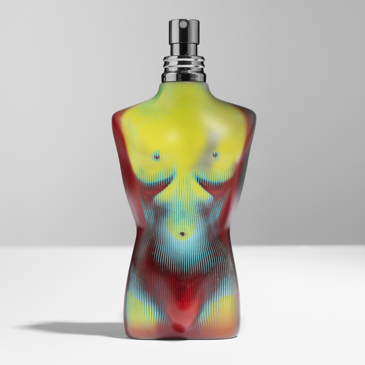
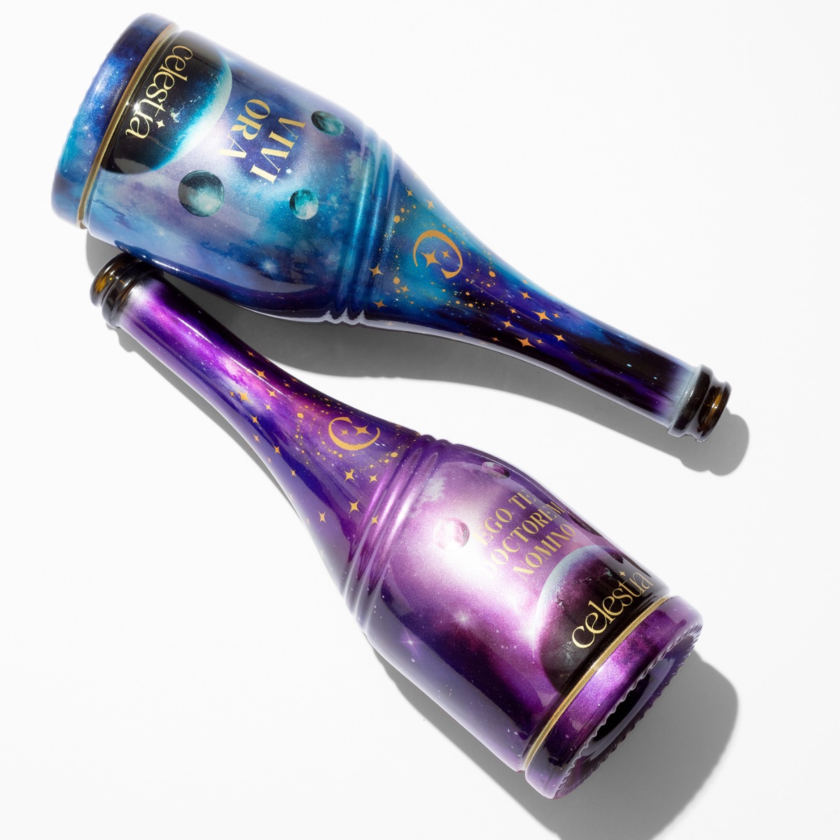
Traditional decoration asks the design to fit the technique: a print area, a flat face, a colour count, a shape that cooperates. Sublimation removes those constraints together. The whole surface is available, including tapered shoulders, curved faces, recessed panels and embossed details, in a single pass with no seam. Photography, gradients, textile patterns and fine type reproduce at 1200 dpi, and because there are no colour separations, an artwork with ten thousand colours costs the same to decorate as a one-colour crest. And nothing is added to the glass: no label, no sleeve, no plastic, so the bottle keeps the weight, the cold and the touch of real material, and stays glass at the recycling plant. The result is a bottle where the artwork and the object are the same thing.
Coverage is a design choice: the same process, four levels of glass in view. How coverage works →
One tested technology, endless results
For a development team, the decisive advantage is not a single spectacular bottle. It is that one technology, qualified once, serves a whole range. Because the colour is unlimited and the surface is the entire object, the same qualified base produces endless outputs: a clear primer with a fine line drawing, a white matte base with a photographic gradient, a metallic dégradé under a pattern, a flanker in a new colour every season. The resistances are tested on the system, not on each design: once primer, top coat and process are validated for a brand, every new bottle, colour variant and edition runs on the same base with no new development cycle. Design changes are digital. A new artwork is a new file, not a new setup: no tooling, no re-industrialisation, no development cost per variant, and several editions can run on the same primer base in the same run.
3 easy steps: Prime · Design · Print
01 — Prime
Every bottle begins with a primer, a waterborne coating that gives the colour its depth and sets the character of the object. It is the first creative decision, because the same artwork reads differently on each base. Finishes are made in-house and practically unlimited; the standards are clear, white gloss, white matte, metallic full or dégradé. Clear lets the glass show through; white makes colour leap off the surface; metallic changes the bottle in the hand. Plymouth Gin sits on a clear primer; Bvlgari on a metallic soft-touch matte; Centonze on white gloss; Le Iconiche on white matte: one technology, four completely different objects.
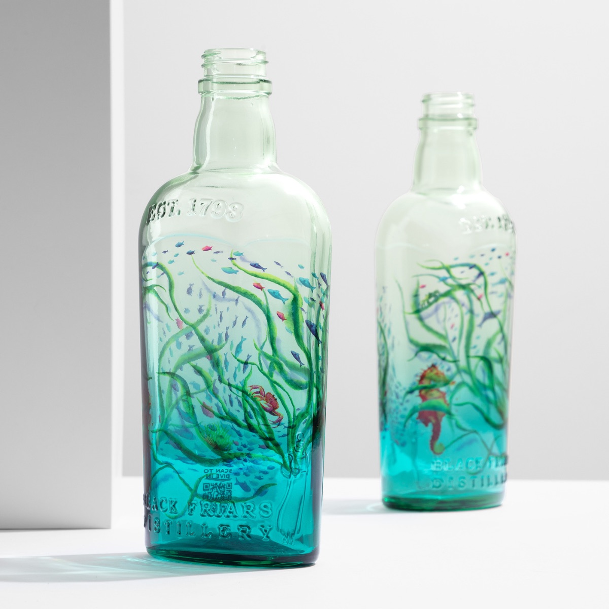
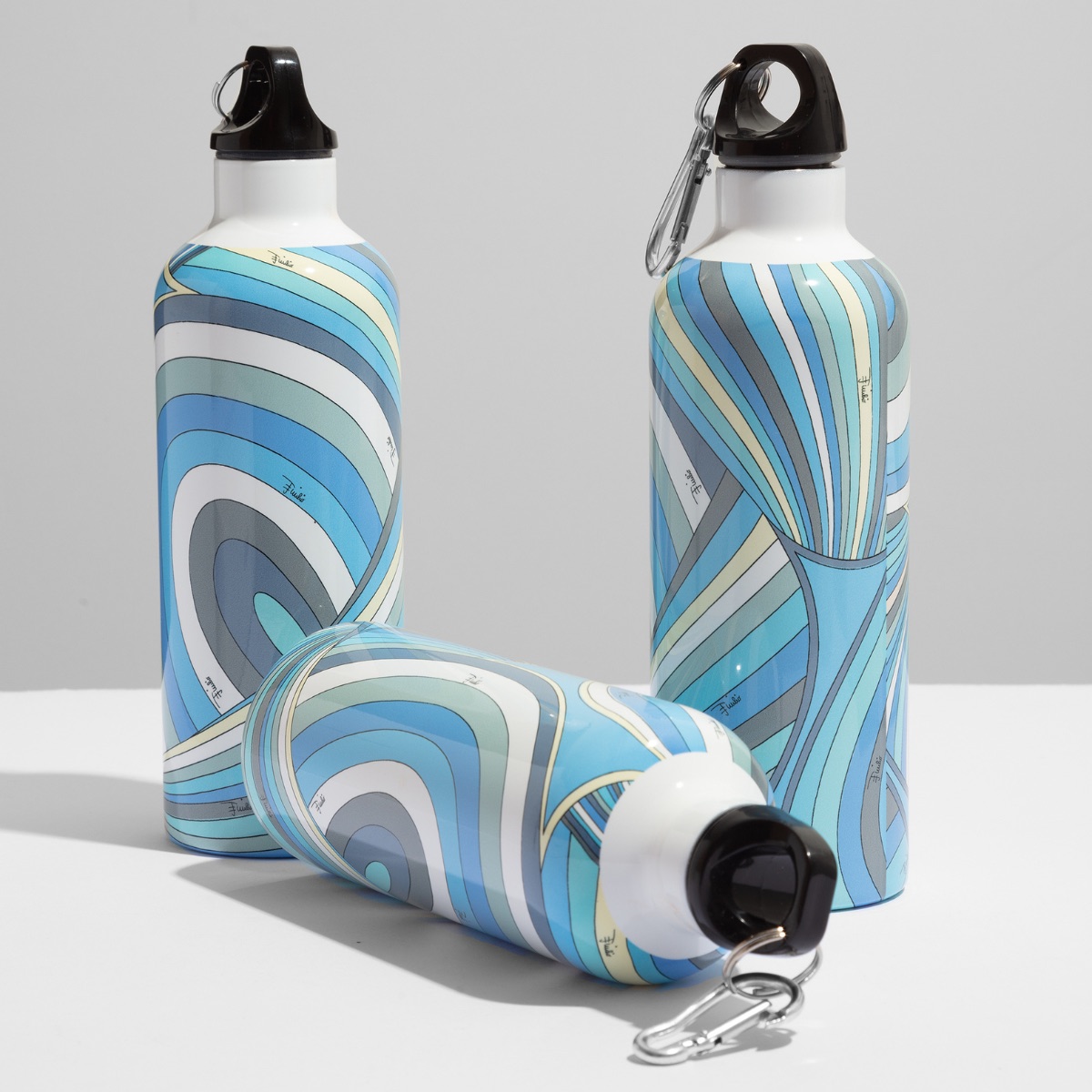
See all finishes on the Creative Minds page → · Apply for the swatch kit →
02 — Design
Any artwork that exists as a file can be decorated: photography, gradients, fine serif type, hundreds of colours, at 1200 dpi and a true 360 degrees. Design flat, in CMYK; Pantone or Cromalin targets are matched through calibrated CMYK, not ink mixing. Two things are planned early. Distortion: flat artwork takes the bottle’s shape, and on curved areas it deforms; we supply the distortion curve for your component, or pre-distort the file for you. The joint: on a full 360° wrap the artwork meets itself, and the meeting point is hidden inside the design through pattern or texture. Plan those two, then break every other rule. Prepare your artwork →
03 — Print
The glass arrives in Verona from the brand’s own glassmaker. On one integrated line it is primed, decorated and cured: one supplier, one entry, one exit. Renderings on your own bottle come first, at roughly 95% fidelity to the finished piece. Then a production-line sample within five working days of the components arriving, made on the same line that will run the order; during a plant visit, a prototype takes about thirty minutes. The approved sample is locked as the reference, and the run is measured against it.
What it needs, and what it does not do
Sublimation needs three things: a primer on the glass, an artwork prepared as a print-ready file, and the bottle itself, supplied by the brand’s glassmaker. It runs on glass, aluminium, zamac and ceramic, which is why a cap and a bottle can share one artwork. Volumes start at 5,000 pieces per design.
It is not a screen print: there are no screens and no per-colour setups, and the colour is see-through rather than opaque, which is what the primer is for. It is not a sleeve: nothing is wrapped around the bottle and nothing has to be stripped before recycling. It is not a lacquer: a single-colour bottle with no artwork is a coating job, which we run on the same line, but it is a different process. And it is not magic: an artwork designed for a flat label will look like a flat label on a curved bottle, which is why the distortion curve and the joint are planned before a sample is made.
Sublimation, screen printing, sleeve, coating
| Sublimation | Screen printing | Shrink sleeve | Coating (lacquer) | |
|---|---|---|---|---|
| Coverage | Full body, 360°, base to neck | Flat panels, limited on curves | Full body | Full body, one colour |
| Colours | Unlimited, photographic, 1200 dpi | One screen per colour | Unlimited, printed on film | One |
| Complex shapes | Yes, including embossed and concave | Difficult | Follows the shape, with distortion | Yes |
| Material added to the glass | None | Ink only | Plastic film | None |
| Setup per design | None: a new file | New screens per colour | New print run on film | None |
| Typical use | Artwork, gradients, editions, ranges | Logos and marks in high volume | Dense regulatory text | Core ranges in a single colour |
Read the full comparison: sublimation vs screen printing →
Where an older technique still makes more sense
Sublimation is not the answer to every brief, and an honest page should say so. A single-colour bottle with no artwork is a coating job, and for a core range it is often the right choice. A two-colour logo on a cylindrical bottle in very high volume, or a brand that wants the glass-like feel of fired screen print, is still well served by screen printing. Metallic accents, a logo on a cap or a star on the front panel, belong to hot stamping. A sleeve remains the choice when a product must stay within a tight decoration budget and the brand accepts a plastic layer on the glass. Where the brief asks for a complex shape, an artwork with more than a few colours, one language across bottle and cap, a sustainability gate or a short window, sublimation leads.
From 300 to 4,000 bottles an hour
Sublimation on glass existed before ATIU, on simple objects and at small scale. ATIU rebuilt it as an industrial process in Verona, starting in 2019: controlled, repeatable pressure, colour that stays faithful at 1200 dpi, and a line that went from 300 to 4,000 bottles per hour, with the same equipment producing the first sample and the full run. Today two plants decorate glass, aluminium, zamac and ceramic for independent houses and groups such as Pernod Ricard and LVMH, from 5,000-piece editions to permanent references. Before ATIU was ATIU →
Made for spirits and perfumery
Spirits and perfumery are where the bottle carries the most of the brand, and where the forms are hardest: sculptural flacons, faceted decanters, recessed panels. Sublimation covers them whole, and because the same process runs on aluminium, zamac and ceramic, cap and bottle share one artwork. Decorated bottles are validated for contact with high-proof spirits and for handling and logistics, and a trial pallet on request lets a brand confirm behaviour on its own filling line. See it applied in spirits and in perfumery.
Beautiful and sustainable
Waterborne primer and inks, free of heavy metals, and nothing added to the glass: the bottle stays glass, in hand and on the sorting line. Net-zero CO₂ since 2023, Scope 1–3. EcoVadis Committed. Pentawards Gold 2025 in Sustainability.
Start with a brief
Send the artwork and the bottle reference, with the volumes you have in mind: renderings on your own bottle first, then a production-line sample in five working days. From there, the run is the sample, repeated.
Go deeper: full-body sublimation, sublimation vs screen printing, preparing print-ready files, behind the scenes of 360° decoration, the Creative Minds page for designers and the swatch kit. Or get in touch.